| Image |
Comment |
| 08/10/2005 05:25:12 AM |
|
 Photographer found comment helpful. Photographer found comment helpful. |
| 08/02/2005 10:09:06 PM |
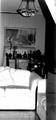
A Simple Placeby Sherri1209Comment by tsheets: Yikes! pretty harsh lighting on the couch. At the top and on the arm, I can see there is texture there, but the hilight has wiped it clean. Also a bit crooked. |
| Photographer found comment helpful. |
| 08/02/2005 08:28:49 AM |
|
| Photographer found comment helpful. |
| 08/01/2005 09:26:35 PM |
|
| 08/01/2005 09:25:12 PM |
Important Date.jpgby Sherri1209Comment by Sherri1209: Great comment.Looking at the picture again I can see that focusing on the mirrored image would have been a much better shot. Thanks again for the advice. |
| 08/01/2005 05:51:33 PM |
Important Date.jpgby Sherri1209Comment by airdance: I'm not trying to be a wise-guy here, just venting what strikes my mind, okay ?
I think the pic would have been better if taken from a position that is a bit more to the right. The brush in her hand interferes with the face in the mirror, which is a shame.
Another idea: try fooling around with another aperture to get more depth of field. Focus on the face in the mirror. The 'real' head in the foreground would become out of focus or blurred, and therefor (imho) less distracting. And don't be afraid of zooming in a little. A subtle glimpse of the 'real' head, just within the frame on the left, would (I think) add a lot more drama to the shot.
Furthermore, a great composition ;) |
| Photographer found comment helpful. |
| 08/01/2005 01:19:34 PM |
|
| Photographer found comment helpful. |
| 07/31/2005 10:47:37 PM |
A Simple Placeby Sherri1209Comment by cools98: Fit Challenge Criteria: 1/2
Color/Contrast: 0/2
Composition: 0/2
Photo Quality: 0/2
My Subjective Affinity: 0/2
Doesn't send any non-verbal message to me. Highlights on the couch are way too blown out, shadows are too dark. The background is very mucch looking and the photo appears a bit tilted to the right. |
| Photographer found comment helpful. |
| 07/30/2005 02:46:07 PM |
A Simple Placeby Sherri1209Comment by tmorninglory96: I think maybe a different angle to the room might have gotten rid of the shadow to the right of the picture. Kinda distracting, love the black and white though. |
| Photographer found comment helpful. |
| 07/30/2005 12:45:39 PM |
|
| Photographer found comment helpful. |
Home -
Challenges -
Community -
League -
Photos -
Cameras -
Lenses -
Learn -
Help -
Terms of Use -
Privacy -
Top ^
DPChallenge, and website content and design, Copyright © 2001-2026 Challenging Technologies, LLC.
All digital photo copyrights belong to the photographers and may not be used without permission.
Current Server Time: 07/15/2026 11:12:01 PM EDT.