| Image |
Comment |
| 12/01/2006 07:25:39 PM |
|
 Photographer found comment helpful. Photographer found comment helpful. |
| 12/01/2006 10:59:29 AM |
|
| Photographer found comment helpful. |
| 12/01/2006 02:41:54 AM |
|
| Photographer found comment helpful. |
| 11/29/2006 03:28:47 PM |
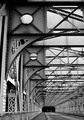
Reach for the Skyby quiet_observationComment by Melethia: Almost looks personified - like a giant robot guy covered in braille, which is kinda cool. I like the perspective and the way the color of the bridge coordinates so nicely with that lovely soft sky. |
| Photographer found comment helpful. |
| 11/29/2006 03:17:57 PM |
|
| 11/29/2006 10:42:24 AM |
Spanby quiet_observationComment by noraneko: I think you got a little bit robbed score-wise on this photo. I suspect the cut-off lamppost may have dragged score down, as it takes away from the composition somewhat. In fact, I'd love to see this photo with just that front lamppost cloned out.
Otherwise- stunning sky and great sharp focus. |
| Photographer found comment helpful. |
| 11/29/2006 09:45:33 AM |
Spanby quiet_observationComment by Melethia: Wow - you almost got my ribbon for no comments during a challenge. True sign of a suck team member! I thought this met the challenge but it didn't quite speak to me. The parts I like best are the barbed wire and the clouds, yet those elements aren't what contributes to what I see as the "perspective". The part I'm not quite sure about is overall, the eye kinda just wanders with no specific place to go. That's not necessarily a bad thing, but in a perspective shot (as I understand them) you do want to try to lead the eye a bit. The upward curve of the support thingie (I lack the terminology) does lead to the sky, but too far on the right of the picture to give you "room", and the rest seems to counteract that leading line. Is any of this making any sense? |
| Photographer found comment helpful. |
| 11/29/2006 01:06:56 AM |
|
| 11/27/2006 10:22:57 AM |
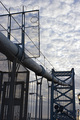
Reach for the Skyby quiet_observationComment by levyj413: I like the angle a lot, but since it's not centered, the centered text makes it look ... disjointed? Centered often isn't as interesting, but it would work well for this symmetrical view, so try to make it really centered.
Also, try a more interesting font.
I missed this in voting, but would've given it a 6. With the changes above, maybe higher. :) |
| Photographer found comment helpful. |
| 11/26/2006 07:48:49 PM |
|
| Photographer found comment helpful. |
Home -
Challenges -
Community -
League -
Photos -
Cameras -
Lenses -
Learn -
Help -
Terms of Use -
Privacy -
Top ^
DPChallenge, and website content and design, Copyright © 2001-2026 Challenging Technologies, LLC.
All digital photo copyrights belong to the photographers and may not be used without permission.
Current Server Time: 07/16/2026 06:53:24 AM EDT.