| Image |
Comment |
| 05/19/2006 02:08:03 PM |
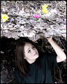
Pushing Up Daisiesby AeroglyphicsComment by trnqlty: This is a very creative entry and I have a hard time figuring out how you did it. The composition works well. You have blown out some details in the flowers and I'm not sure the selective desaturation really adds to the shot. Another thing that might help, although would definetly take more time, is having more daisies in the shot. The last thing that could stand a little improvement is the facial expression of the model. It seems almost pained and could stand to be a tad more pleasent. With all that said you still did pretty well and I look forward to seeing more of your work in the future. |
 Photographer found comment helpful. Photographer found comment helpful. |
| 05/19/2006 08:42:08 AM |
|
| Photographer found comment helpful. |
| 05/18/2006 01:16:57 PM |
|
| Photographer found comment helpful. |
| 05/17/2006 04:59:59 AM |
|
| Photographer found comment helpful. |
| 05/11/2006 01:31:02 PM |
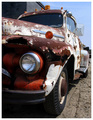
Characterby AeroglyphicsComment by cryan: Great truck shot with lots of texture. I wouldn't mind seeing this as a B&W. IMO that would greatly increase the power of the image. |
| Photographer found comment helpful. |
| 05/09/2006 10:32:29 PM |
|
| Photographer found comment helpful. |
| 05/09/2006 04:36:37 PM |
Pushing Up Daisiesby AeroglyphicsComment by Grahve: Great idea and excellent execution. I am not sure that they are daisies but maybe I am being difficult. I really like the idea here. Good luck |
| Photographer found comment helpful. |
| 05/08/2006 06:06:22 PM |
Characterby AeroglyphicsComment by dahkota: This image has an excellent point of view but I agree with a previous commenter - crop more of the image. Often, in pictures, less is more - let the viewer fill in all the other details - we don't need the rest of the truck to know what it is. In this challenge, I gave you a 6 - it was a well taken image. |
| Photographer found comment helpful. |
| 05/08/2006 05:00:27 PM |
Characterby AeroglyphicsComment by _eug: In my opinion the image suffers from being oversaturated. Also the composition is bright in the upper right and dark shadows in the lower left. Needs some balance in that regard. Try cropping out from the turnsignal up and mid bumper down (landscape). |
| Photographer found comment helpful. |
| 05/08/2006 04:50:00 PM |
Characterby AeroglyphicsComment by front_element: Another thing to try would be to move further back and zoom in. This would compress the perspective and concentrate the eye on the tones and textures. |
| Photographer found comment helpful. |
Home -
Challenges -
Community -
League -
Photos -
Cameras -
Lenses -
Learn -
Help -
Terms of Use -
Privacy -
Top ^
DPChallenge, and website content and design, Copyright © 2001-2026 Challenging Technologies, LLC.
All digital photo copyrights belong to the photographers and may not be used without permission.
Current Server Time: 07/15/2026 07:10:15 PM EDT.