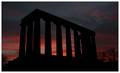
Scottish National Monument - Sunriseby
agwrightComment by e301: You know, I'm not certain that a white border is the way to go - has the inevitable consequence of making the image appear darker, and it seem to be to be pretty dark already. black, I think, would have given a greater sense of looming against a lightening sky. Still, whatever, as we must say these days.
Tonality is good, the hint of haloing from sharpening perhaps is an annoynace in such clean lines, and between a silhouette and a dark sky: I would guess the radius setting needs reducing, to something like 0.6 or 0.5, to get rid of that. A guess, though.
Perhaps I should critique the image itself now, hhaving done the technicalities and the border? Well, perhaps my priorities in terms of subject speak more eloquently than my words ... it doesn't do it for me, much, I fear. The size of the thing seems reduced, I'd want a sense of an enormous sky, and an enormous monument against it, and this feels jus too weak, too reduced. Wider angle lens, closer shot - just as much momument and more sky? Don't know, but I feel it cries out for something like that.