fragmented ladder to the skyby
ritaardComment by sylandrix: Greetings from the Critique Club...
FIRST IMPRESSION... As an honest disclaimer, I am generally not fond of photographs that have lots of empty space (not that your space is technically empty), but I've always liked photos having dominant subjects. That said, my personal preference has never influenced my contest scores, or allow me to acknowledge good shots such as the one you've managed to capture.
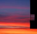
COMPOSITION... I feel that putting something at the extreme edge of a photo works really well when complimenting something else that is more dominant. For instance, if you had another square structure on the lower left of the photo that went into the shot more (say, that filled the whole lower left third), then the two shapes might work together in providing a pleasing composition. Alone like that, I would have moved the frame to the right so that the dark object falls directly on an imaginary line dividing the photo into thirds. The sky is cropped very well, with a dramatic shift in light color on a low horizon line. I think that works very nicely. I would have just liked to see the frame filled with something more than just sky and a small structure to the left. (Keep in mind, even like you've presented it, the composition still works - it imparts a very abstract quality, reminds me of that painting with just the different colored and sized squares)
TECHNIQUE... I must say the exposure is just right for the sky, and as a result, having the structure completely dark except for the small hint of color reflecting off that small piece is a nice touch (whew, run-on sentance, i can see my english teacher wincing). Quality of digital image is also very good. Don't think there's really much else on the technical side...
OVERALL... I can't say I was there to see what subject you had to work with, if moving the frame to the right would help or hinder the subject. Also, Whenever I want to see empty space I want to just crop it out and move in closer to what's there. If you did that it in this case, you wouldn't have an interesting picture - obviously the space is an essential component to your photo... In these cases, I just try to put as much in as needed rather than try to fill the frame with empty space.