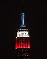
Patriotic Empireby
MPRPROComment by HBunch: *Critique Club*
Nice contrast in the photo. I thinkt he lights are light enough and the darks are dark enough to make this high contrast.
It's a bit odd that we can't see all of the building. One commenter mentioned that they like how you show more than just the color part, but in my own personal opinion, I think I wish I could see at least the outline of the building in the non red white and blue parts.
Focus from what I can tell is great. However, we can't really see much detail in the building at all, everything is so small. Which in reality isn't your fault, however, I keep squinting and getting real close to the screen to try to see more detail (which of course doesn't work).
The colors are neat. I wish the blue was as strong as the red and white, but not enough that it distracts from the photo in any way.
I do which there were some dramatic angle or have the building off center a bit. I think that would create some added interest and have more visual appeal that way.
SOme things work very well centered, and some things just need something extra. This is one of those shots that just need a little something extra to push it to pop.
~Heather~