| Image |
Comment |
| 09/23/2005 03:40:48 PM |
|
 Photographer found comment helpful. Photographer found comment helpful. |
| 09/23/2005 06:04:23 AM |
|
| Photographer found comment helpful. |
| 09/22/2005 11:54:54 AM |
The Sentinelby TheresaAComment by SandyP: There's something so artistic about this shot. It draws me in, and I really love it! Very creative and well-done!!!! 10 |
| Photographer found comment helpful. |
| 09/22/2005 01:26:03 AM |
The Sentinelby TheresaAComment by Nald: Skin has a blue/green hue to it......shot meets challenge; I like the setup of the shot. The post processing is hurting you here IMHO. 4 |
| Photographer found comment helpful. |
| 09/21/2005 02:29:02 PM |
The Sentinelby TheresaAComment by xylke: B&W skin with sepia tone just does not agree with me. Plus the lower right focus point of the subject seems a bit broad. |
| Photographer found comment helpful. |
| 09/20/2005 08:59:09 PM |
|
| Photographer found comment helpful. |
| 09/20/2005 07:42:45 PM |
|
| Photographer found comment helpful. |
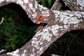
| 09/20/2005 12:13:20 PM |
Wounded Branchby TheresaAComment by Di: **CRITIQUE CLUB**
This photo had a lot of potential. The cut branch fits very well with the title of your photo.
The lichen has hot spots on it from your flash. By stepping back and zooming in a bit you would have lost that and given the background more blur. I would also have liked to see you pull the stick immediatley behind it out to remove it from the photo. It is a touch distracting from the cut in the wood. By cropping in a bit also you woudl make the cut in the wood more noticeable.
Good Luck in future Challenges :)
|
| 09/19/2005 07:55:13 PM |
|
| Photographer found comment helpful. |
| 09/15/2005 04:27:38 PM |
Vintage Viewby TheresaAComment by SandyP: What a great perspective! This picture is so crisp and sharp and I love the total whiteness of the background. I love the pink splash of the trim too. This is great! 10 |
| Photographer found comment helpful. |
Home -
Challenges -
Community -
League -
Photos -
Cameras -
Lenses -
Learn -
Help -
Terms of Use -
Privacy -
Top ^
DPChallenge, and website content and design, Copyright © 2001-2026 Challenging Technologies, LLC.
All digital photo copyrights belong to the photographers and may not be used without permission.
Current Server Time: 06/27/2026 05:20:35 AM EDT.