| Image |
Comment |
| 10/01/2005 03:07:39 PM |
For Whom The Bell Tollsby TheresaAComment by PhantomEWO: Very striking with great color and contrast. Super work on depth of field keeping the focus throughout the entire photo. Definately a tower of Biblical proportions, well chosen for this challenge. Good work! |
 Photographer found comment helpful. Photographer found comment helpful. |
| 09/30/2005 04:28:26 PM |
|
| Photographer found comment helpful. |
| 09/29/2005 07:54:03 PM |
|
| Photographer found comment helpful. |
| 09/29/2005 01:00:16 PM |
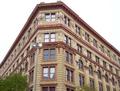
For Whom The Bell Tollsby TheresaAComment by SandyP: HOW interesting!!! It looks surreal the way the brick curves like that! AWESOME!!! Very interesting too that it has the little moon in it :) I love it!!! |
| Photographer found comment helpful. |
| 09/28/2005 07:37:18 PM |
|
| Photographer found comment helpful. |
| 09/28/2005 12:38:39 PM |
|
| Photographer found comment helpful. |
| 09/25/2005 05:09:32 PM |
|
| Photographer found comment helpful. |
| 09/25/2005 12:07:57 AM |
The Sentinelby TheresaAComment by Tammer: While I can visualize the rule of thirds, I don't particularly care for the overall color treatment you chose. It's always odd to see people with blue faces. I'd be curious to know what look you were going for. |
| Photographer found comment helpful. |
| 09/23/2005 08:44:29 PM |
The Sentinelby TheresaAComment by cwalmye: N ice job following the rule of thirds, it seems a bit over, but what can you asay. I really don't like the blue-ish color in the man's face, I think it's tryijng just a little too hard to be artistic. |
| Photographer found comment helpful. |
| 09/23/2005 06:24:56 PM |
Vintage Viewby TheresaAComment by Philos: Critique Club Comment:
Perspective,
I didn't like the challenge as soon as I saw it. There are so many “perspectives” that nobody knows what to do with it. It's kind of an open challenge.
I think this photo shows perspective like i would have captured if I was in the challenge.
It's a good photo with lots of lines color, and it's an interesting photo too.
I can't put my finger on it why it didn't score better, I would have given it a 7.
The only things that could improve this pic imho are the trees on the bottom, they are distracting, and the sky is a bit boring and blown out.
Keep on shooting.
Peter |
Home -
Challenges -
Community -
League -
Photos -
Cameras -
Lenses -
Learn -
Help -
Terms of Use -
Privacy -
Top ^
DPChallenge, and website content and design, Copyright © 2001-2026 Challenging Technologies, LLC.
All digital photo copyrights belong to the photographers and may not be used without permission.
Current Server Time: 06/27/2026 05:20:00 AM EDT.