| Image |
Comment |
| 07/20/2006 06:12:19 PM |
|
 Photographer found comment helpful. Photographer found comment helpful. |
| 07/19/2006 06:03:27 PM |
|
| Photographer found comment helpful. |
| 07/19/2006 12:58:40 AM |
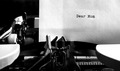
Stemsby vprndsgComment by Schuff: Hmm, I think I like the simple colors and shapes here. Not a "DP WoW" shot but a kitchen wall hanger type maybe? |
| Photographer found comment helpful. |
| 07/17/2006 10:25:24 PM |
|
| Photographer found comment helpful. |
| 07/12/2006 10:54:46 AM |
Dear Momby vprndsgComment by Matt414ce: This and staples were my favorites in the challenge. Good job. I was one of your tens! |
| Photographer found comment helpful. |
| 07/11/2006 08:16:11 AM |
Dear Momby vprndsgComment by lauralink: How delightfully old-fashioned! Very clear photo in B&W form. Effective use of elements and tight composition. Nice. |
| Photographer found comment helpful. |
| 07/09/2006 09:21:23 AM |
Dear Momby vprndsgComment by polite: Nice B&W. Nice lighting, great contrast. Nice texture on the ruler, paper and the wheel. The ribbon holder may be a bit too much "washed out dead space" and there is a strange square around "Dear Mom", which doesn't look like it belongs, otherwise fantastico! Keystroke in motion is a great adea, even better with slower shutter! Nice! |
| Photographer found comment helpful. |
| 07/08/2006 02:15:31 PM |
Dear Momby vprndsgComment by yanko: Apparently you don't have much to say to her. :P (J/K). I like the sharpness here. Great job capturing the paper's texture and not blowing it out. The sides of the typewriter seem a bit too bright but it's not a huge distraction. Also, nice touch going b/w here. The only suggestion for improvement is have more typed on the page. It would have made the image hold the attention of the viewer longer. |
| Photographer found comment helpful. |
| 07/07/2006 07:47:05 PM |
Dear Momby vprndsgComment by scaramanga: I like this. Great that you can see the paper's texture. I especially like that the letter is nearly empty. |
| Photographer found comment helpful. |
| 07/07/2006 03:15:06 PM |
|
Home -
Challenges -
Community -
League -
Photos -
Cameras -
Lenses -
Learn -
Help -
Terms of Use -
Privacy -
Top ^
DPChallenge, and website content and design, Copyright © 2001-2026 Challenging Technologies, LLC.
All digital photo copyrights belong to the photographers and may not be used without permission.
Current Server Time: 07/15/2026 05:35:02 PM EDT.