| Image |
Comment |
| 03/12/2006 09:04:24 AM |
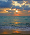
What was, and is, and is to come...by DrAchooComment by tate: Wonderful rise / set ... but This is screaming Shadow/Highlight to me. I'm viewing on a MAc which is a bit lighter normally but I think that if the image had more dark areas the light ones would be stronger. I really like the bottom of the image (foreground sand etc. |
 Photographer found comment helpful. Photographer found comment helpful. |
| 03/12/2006 08:51:28 AM |
|
| Photographer found comment helpful. |
| 03/12/2006 08:24:19 AM |
Art Decoby DrAchooComment by TooCool: You shoulda made the people in the room to the left of the sign turn off their damn lights so ya coulda got a good shot... :-P
TC |
| Photographer found comment helpful. |
| 03/11/2006 07:01:08 PM |
|
| Photographer found comment helpful. |
| 03/11/2006 09:07:27 AM |
|
| Photographer found comment helpful. |
| 03/10/2006 11:11:26 PM |
|
| Photographer found comment helpful. |
| 03/10/2006 03:47:29 PM |
|
| Photographer found comment helpful. |
| 03/10/2006 12:23:04 PM |
Art Decoby DrAchooComment by xianart: fascinating. the flash of blackand white makes you look again. that said, the sectionunder the marquee is just annoying. it should be burned much darker. |
| Photographer found comment helpful. |
| 03/10/2006 11:21:48 AM |
|
| Photographer found comment helpful. |
| 03/09/2006 11:02:37 PM |
|
| Photographer found comment helpful. |
Home -
Challenges -
Community -
League -
Photos -
Cameras -
Lenses -
Learn -
Help -
Terms of Use -
Privacy -
Top ^
DPChallenge, and website content and design, Copyright © 2001-2026 Challenging Technologies, LLC.
All digital photo copyrights belong to the photographers and may not be used without permission.
Current Server Time: 05/08/2026 02:44:07 PM EDT.