| Image |
Comment |
| 12/09/2006 05:10:10 PM |
3by hannekeComment by Jaded_Housewife: very nice! I love the physical closeness of the "grandmother" and "mother". They are sitting in such an intimate way that only a mother and daughter would. and there interest in the "grandchild" is very heartwarming as well. great work. the tones look too blueish for me but I'm not sure if you wanted it that way. Lovely shot no matter what! |
 Photographer found comment helpful. Photographer found comment helpful. |
| 12/09/2006 04:06:38 PM |
GAME OVERby hannekeComment by Brad: Oohhhhh - shorter & darker hair incognito hey?
I'm not sure I'll ever wanna' play a game with you.
Perfect shot for this challenge! |
| Photographer found comment helpful. |
| 12/09/2006 09:12:01 AM |
|
| Photographer found comment helpful. |
| 12/09/2006 02:09:50 AM |
GAME OVERby hannekeComment by klstover: Was this inspired by the Soul Calibur 3 character Zasalamel? I wouldn't have thought it at first except for your title. Let me know! :) Anyway, I'm back to bump up a few scores and I can't bump yours anymore so yeah. :-) I think this is just great.. so bold.. and it's staged obviously, but somehow (usually I don't like obviously staged shots) it just realy seems to work. I think with the lighting being so bold it sort of just all fits. Background is awesome as well as expression of the model. Great shot. |
| Photographer found comment helpful. |
| 12/08/2006 07:49:19 PM |
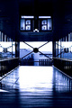
6 & 7by hannekeComment by yanko: I also like the shot but it's missing something. For me this isn't really about the architecture so the symmetry while good isn't carrying the shot like it normally would. It's the signs hanging from above that changes it for me. Also that big X in the back, which can also be read as a 'sign'. Hence, the photo is really about the signs present more so than the architectual design of the building. That being the case I feel having a human element in the shot was critical. Even if it's just a motion blur of someone passing by the photo would have had a much bigger impact. Anyway, just my thoughts. I missed this shot during the voting but probably would have given this a 6 or a 7.
Edited to add, your editing is really good here. I forgot to mention that. Message edited by author 2006-12-08 19:51:12. |
| Photographer found comment helpful. |
| 12/08/2006 02:30:47 PM |
6 & 7by hannekeComment by mpeters: The blue toning is very good and i like the boldness of the shapes and lines. The upper half is black with no little to no detail and the lower is very light, almost white and i wish both areas registered some detail.
The symetry is perfect and it would look great printed BIG. |
| Photographer found comment helpful. |
| 12/08/2006 01:46:52 PM |
6 & 7by hannekeComment by posthumous: I didn't comment but I gave it a 7. um... pretty much what DrAchoo said. It's got a lot of what I look for in an architectural shot. |
| Photographer found comment helpful. |
| 12/08/2006 01:36:11 PM |
6 & 7by hannekeComment by DrAchoo: personally I gave it a 7. I enjoyed the tones and the symmetry. |
| Photographer found comment helpful. |
| 12/08/2006 12:18:27 AM |
|
| Photographer found comment helpful. |
| 12/07/2006 11:45:27 PM |
Kiss meby hannekeComment by klstover: Amazingly beautiful composition. I love how the.. um, offshoots from the main stem, I guess? are arranged on opposite sides of the main diagonal line. |
| Photographer found comment helpful. |
Home -
Challenges -
Community -
League -
Photos -
Cameras -
Lenses -
Learn -
Help -
Terms of Use -
Privacy -
Top ^
DPChallenge, and website content and design, Copyright © 2001-2026 Challenging Technologies, LLC.
All digital photo copyrights belong to the photographers and may not be used without permission.
Current Server Time: 05/09/2026 09:16:55 PM EDT.