| Image |
Comment |
| 05/29/2006 05:29:40 PM |
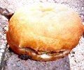
Jackpot!!by OddfrogComment by jerryc12: Overexposed and somewhat blurred. Doesn't really fit subject "success" that well. |
 Photographer found comment helpful. Photographer found comment helpful. |
| 05/29/2006 09:30:55 AM |
Jackpot!!by OddfrogComment by exonmark: Great presentation of the theme. Technically I think the ant could be better positioned - it is slightly hidden in the shadow of the bun. Also the top of the bun is a little overexposed. Result 7. |
| Photographer found comment helpful. |
| 05/28/2006 12:06:25 PM |
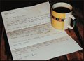
Memoriesby OddfrogComment by Rooster: Hey there from the CTPII!
This is an interestng shot to try and figure out. I wished you had taken a bit of time to explain the shot as you had conceived it in your comments section.
Some things I would do to if this were my shot. I would bump up the levels as the eposure seems a bit on the dark side. More light prolly would make the shot abit sharper too. Not sure why you might have used iso 200 tho for a still life. Perhaps slow down the shutter speed and just use 100 iso or lower.
So what is the focus of this shot? Is it an old letter? It's hard to tell. What's with the coffee stains? Is it significant? If so how? These are questions I'm asking from looking at the pic and am not sure that I can figure stuff out from it.
Hope this helps.
peace
rooster |
| Photographer found comment helpful. |
| 05/28/2006 07:33:04 AM |
Jackpot!!by OddfrogComment by temba: Great idea and well set up. Shame about the exposure - the top of the image looks really overexposed. |
| Photographer found comment helpful. |
| 05/27/2006 06:25:48 PM |
Memoriesby OddfrogComment by Gunnsi: CTCP2 Gunnsi
First impression: I want a coffe :-) and Why are there so many coffe stains? Dull colours. Nice idea, well executed. Good focus.
What can be better?
Brighter colours, fewer coffe stains on paper, use NeatImage to get rid of grains.
|
| Photographer found comment helpful. |
| 05/26/2006 03:16:47 PM |
Jackpot!!by OddfrogComment by BeeCee: This might have been better if you'd cropped to about the bottom left quarter to highlight the ant instead of the overly bright burger. We'd have still gotten the impression of a BIG find for him, but would have seen it quicker without the unattractive distractions. It's a good idea, though :) |
| Photographer found comment helpful. |
| 05/25/2006 08:54:59 PM |
Memoriesby OddfrogComment by Rebecca: Hi Laura -
The first thing that strikes me about this photo is that the lighting looks a little too snapshotty. I would like to see this lit from several directions, and with a warmer tone. The shadow behind the mug is rather harsh. Coffee is usually associated with waking up in the morning (at least in the USA), so some lighting that also implies morning would make this a much stronger image. I like the composition, the coffee rings on the letter. The arrangement and idea are nice. |
| Photographer found comment helpful. |
| 05/25/2006 07:11:27 PM |
Memoriesby OddfrogComment by margiemu: From Ctp2:
This is an interesting shot, that causes me to stop and look at it. I'm not sure I'd really consider it a 'still life' in the traditional sense. It might have fit better under a different theme. I like the idea, though. The lighting and composition are OK, although, maybe just a tad dark. |
| Photographer found comment helpful. |
| 05/25/2006 02:21:34 PM |
Jackpot!!by OddfrogComment by mhazel: The concept here is pretty good but the photo itself has a number of issues. The most noticcable would be the exposure as the bun has a huge burned out highlight. The composition seem a bit off as the bun is a little tight on the right side. I think it might have made a better point if the shot was taken at ground level to grab that ant's ponit of view. The color saturation and contrast seems to be set a few point to high. Keep trying :) |
| Photographer found comment helpful. |
| 05/25/2006 12:07:09 PM |
Jackpot!!by OddfrogComment by Man_Called_Horse: I see where you are going with this image, but....
Ok comp, blown out whites, blacks need help, ok texture, light very harsh, color flat, movement ok |
| Photographer found comment helpful. |
Home -
Challenges -
Community -
League -
Photos -
Cameras -
Lenses -
Learn -
Help -
Terms of Use -
Privacy -
Top ^
DPChallenge, and website content and design, Copyright © 2001-2026 Challenging Technologies, LLC.
All digital photo copyrights belong to the photographers and may not be used without permission.
Current Server Time: 07/16/2026 06:50:23 AM EDT.