| Image |
Comment |
| 05/09/2007 01:13:14 AM |
|
 Photographer found comment helpful. Photographer found comment helpful. |
| 05/01/2007 09:23:01 AM |
|
| 04/29/2007 02:20:46 AM |
|
| Photographer found comment helpful. |
| 04/29/2007 01:10:08 AM |
|
| Photographer found comment helpful. |
| 04/26/2007 06:06:15 PM |
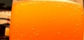
Vitaminsby dstrahinovComment by PDXKim: I like the gradiant in the OJ. The background on the left is very distracting - maybe some other breakfasty type thing could have been set over there or something darker. |
| Photographer found comment helpful. |
| 04/25/2007 05:50:45 PM |
Vitaminsby dstrahinovComment by corinne: I am not sure I 'get' this photograph. It looks like lethithn. Oh, wait, now I am thinking that it is bubbles in a glass. It would have looked spectacular if you cropped the left and top to only show the uniform orange colour. Anyway, I like it. |
| Photographer found comment helpful. |
| 04/25/2007 04:53:12 PM |
Vitaminsby dstrahinovComment by Jammur: the skewed angle hurts, its an effective approach for adding drama, but does wokrs with your subject. |
| Photographer found comment helpful. |
| 04/25/2007 03:02:47 PM |
|
| Photographer found comment helpful. |
| 04/25/2007 12:53:06 PM |
Vitaminsby dstrahinovComment by SaraR: There are bubbles but the composition is uninspiring. The orange is very vibrant, and would have looked great against a plain contrasting background. |
| Photographer found comment helpful. |
| 01/22/2006 08:39:40 PM |
|
| Photographer found comment helpful. |
Home -
Challenges -
Community -
League -
Photos -
Cameras -
Lenses -
Learn -
Help -
Terms of Use -
Privacy -
Top ^
DPChallenge, and website content and design, Copyright © 2001-2026 Challenging Technologies, LLC.
All digital photo copyrights belong to the photographers and may not be used without permission.
Current Server Time: 07/16/2026 09:30:50 AM EDT.