| Image |
Comment |
| 09/23/2002 01:29:00 PM |
|
| 09/23/2002 10:07:00 AM |
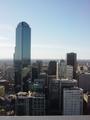
Melbourne Skylineby rstocksComment by Gracious: Good skyline picture and certainly meets the challenge. I think it would have more punch to it if had more contrast and the color more saturated. Or to completely remove the color and do a b & w with more contrast. The colors are too drab to really add virtue to the image imo and that's why I have made these suggestions. However, you MUST shoot to please yourself. I hope these comments help and not hurt. :-) Good luck in the challenge! Grayce aka Gracious |
| 09/23/2002 06:38:00 AM |
Melbourne Skylineby rstocksComment by DougPaz: Neat shot. It seems to me it would benefit if the horizon line wasn't so dead center though. Perhaps just a but higher would make the building on the left seem taller. |
| 09/23/2002 02:10:00 AM |
|
| 09/23/2002 12:34:00 AM |
Melbourne Skylineby rstocksComment by alanfreed: One of the places I'd love to visit someday! Overall, it's a cool shot... my suggestions would be to pan a little higher to eliminate the ledge, and to try not to split the shot in the center so much where the sky meets the city... |
Home -
Challenges -
Community -
League -
Photos -
Cameras -
Lenses -
Learn -
Help -
Terms of Use -
Privacy -
Top ^
DPChallenge, and website content and design, Copyright © 2001-2026 Challenging Technologies, LLC.
All digital photo copyrights belong to the photographers and may not be used without permission.
Current Server Time: 07/15/2026 01:32:25 PM EDT.