B.S.A. (Botanical Society of America)by
davidus428Comment by littlegett: From the Critique Club
How are you doing today? I am going to touch on a few items with your image.
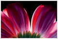
Colour;
This image has some beautiful colour. I really enjoy that touch of green at the bottom, I think it adds a strong contrast and holds the images' interest for the viewer. The transitions between colours are smooth and delicate.
DOF/Focus;
It appears the green is slighting more in focus. It could be due to the texture difference, but everything seems to be strong and with this being a nearly 2D image the overall focus is nice.
Post;
I don't know what your post steps are, only basic editing is listed. Overall the image looks well done with only a couple items I will talk about below.
Off Items;
As much as I like this, the Dark tips of the petals that almost blend in the background really distracts the image for me. Even though I can see the full petals, they give the appearance of incompletion where it should be complete. Maybe angling your light stronger, or adding a second smaller light to keep the tips a bit lighter as to show the full effect. Also, the weakest part of the flower is also the spot of light area creating a blown highlight. My eye tends to be drawn right to that spot because of the darkness of the rest of the image.
Other;
I like your idea, and the border is nice as well. Your image was very well excepted by the voters. I believe you did a great job overall, and with a couple minor tweaks it can be a ribbon winner.
Nice Job
Andrew 'littlegett'