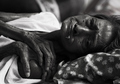
Desolate
by
davidus428Comment by HBunch: *Critique Club*
This image is so very dark. The 2 areas of interest to me are the face and hands, and they both seem to be hidden away in the darkness. I would have preferred to see some extra lighting or something in those areas. The eyes for example are too dark for me to really gather an expression from her.
One thing for me that is a distraction is the thing hanging out of her mouth? It's so much lighter against the darkness of the photo in that area that it stands out a lot and is definately unappealing.
Now, I would expect a photo of 'failure' to probably not be very attractive, but non the less, it doesn't make it any more interesting for me to look at.
The shot evokes emotion. I feel bad for the lady and am saddened by her situation, but at the same time, it's just not appealing to look at as an image.
Maybe a good photojournalism shot. Focus is dead on. Nice crisp lines throughout, with a properly blurred background to eliminate background distractions.
I like the positioning of her, and the framing you chose. He hands confuse me. They are at a very awkward angle, almost like there is another person's hand in the pic.
Overall, powerful image. Not much else to add.
~Heather~