DPChallenge: A Digital Photography Contest You are not logged in. (log in or register
 
Browse Settings
Currently viewing:
Registered Usertakethat

Show comments:

Per page:

Order:

Comments:


Comments Received by takethat
Pages:   ... ...
Showing 81 - 90 of ~215
Image Comment
... I see industry
03/29/2003 04:46:28 PM
... I see industry
by takethat

Comment by jmsetzler:
Greetings from the Critique Club :)

Hi Takethat...

This photo definitely meets the challenge theme of 'from above' without doubt. The camera angle also creates an interesting tilt on the horizon.

Compositionally, I think the photo is ok. I think it is simply lacking a strong subject overall. It's an interesting scene as a whole, but the subject material, in my opinion, is not creating a high impact photo for me.

When you start considering your ideas for challenge photos, you may want to spend equal amounts of time considering your subject choices and your challenge theme. This shot is all about the challenge theme, but weak on the subject in my opinion...

Keep up the good efforts :)

John Setzler
A Few of LA's Arteries
03/23/2003 11:19:39 AM
A Few of LA's Arteries
by takethat

Comment by karmat:
CRITIQUE CLUB CRITIQUE
by karmat

COMPOSITION
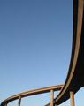
I like how you have taken a picture of something "ordinary," or at least common, and used made it interesting by making it into an abstract. It is composed really well, I think, because the eye follows the ramp down the right and across the frame at the bottom, then loops back. excellent. Did you try flipping so that it would be a left to right flow? I don't know that it would have been necessarily better, just different.
The sky also produces negative space which is very effective in this shot to emphasize the bridges.

TECHNIQUE
The blue sky really makes this shot, though it almost seems a touch blown out at the bottom. Not enough to really detract though. I, personally, do not see the artifacts others are mentioning, but then again, maybe I need glasses or something. To me, it looks focused and clear. I like the way hte shadows help accentuate the motion. I do see some the moire pattern or banding in the sky. Perhaps NEATIMAGE, or another similar filter could help smooth that out

OVERALL EFFECT
This shot seems to serve to show the vastness of the road system. Though it is but a small part, and is a simple picture, it speaks of the massive confusion that sometimes comes when trying to navigate such things (especially for me!)

Good work and best to you in future challenges
... I see industry
03/23/2003 08:18:08 AM
... I see industry
by takethat

Comment by 'Pong:
The slope skyline is confusing the image, IMO
... I see industry
03/19/2003 02:17:07 AM
... I see industry
by takethat

Comment by KIKI:
THE TOP RIGHT CORNER FLOWS INTO THE LEFT TOP CORNER TO MAKE A VERY GOOD VANTAGE POINT- LIKE THE COLOR SCHEME OF THE CARS!
... I see industry
03/19/2003 01:06:09 AM
... I see industry
by takethat

Comment by ChrisW123:
Pretty cool, the horizontal cars and tilted horizon makes an interesting effect to this picture. I like it. :)
... I see industry
03/18/2003 07:55:42 AM
... I see industry
by takethat

Comment by GreggeN:
Nice idea but I think the wonky angle detracts a little from this one.
... I see industry
03/18/2003 01:40:57 AM
... I see industry
by takethat

Comment by Silver Fox:
Good job on this shot.
Lots of colour in this picture, good content, meets thechallenge that's for sure.
... I see industry
03/17/2003 10:00:46 AM
... I see industry
by takethat

Comment by vtruan:
lost horizon loses me.
A Few of LA's Arteries
03/16/2003 01:09:15 AM
A Few of LA's Arteries
by takethat

Comment by GeneralE:
Glad to see someone else use freeway ramps...like your cropping/framing.
A Few of LA's Arteries
03/16/2003 12:43:48 AM
A Few of LA's Arteries
by takethat

Comment by Artifacts:
The twisting ribbon-like quality is brought well by the exceptional placement in the overpass intersection in the lower left quadrant.

The sinuous quality is outstanding. It is emphasized by the two parts of the overpass stretching to opposite sides of the image. Well cropped.

Simple is better and that is certainly true of this image.
Pages:   ... ...
Showing 81 - 90 of ~215


Home - Challenges - Community - League - Photos - Cameras - Lenses - Learn - Help - Terms of Use - Privacy - Top ^
DPChallenge, and website content and design, Copyright © 2001-2025 Challenging Technologies, LLC.
All digital photo copyrights belong to the photographers and may not be used without permission.
Current Server Time: 08/04/2025 06:50:43 PM EDT.