| Image |
Comment |
| 06/01/2007 04:51:32 PM |
|
| 06/01/2007 04:36:14 PM |
|
| 06/01/2007 09:29:52 AM |
|
| 06/01/2007 08:13:01 AM |
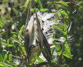
Ou--ch!by VanGoghComment by Oded: hi
I always wondered why do people like you post this kind of photos on DPC.
this is a web site for photography for people who want to learn and display their work. sure some do better and some worse (I do badly as I am not such a great photographer but at least I try).
surely you will agree with me that there is nothing in this photo that puts it in a photography site (apart from the fact that its a photo), no creativity, no skill, no nothing. It's just a snap shot of your kids and not even a good one at that. If you want the world to see your kids (not that I can tell the difference between them and the other billion kids around the world) surly there's some web site for family snapshots but why wast our time voting on such a pic. -1 |
| 06/01/2007 12:58:44 AM |
Ou--ch!by VanGoghComment by SDW: To much of a snapshot for a free study challenge. Nice kid moment. |
| 05/21/2007 09:19:17 AM |
|
| 09/24/2006 10:21:21 AM |
|
| 09/21/2006 04:27:02 PM |
Battle scarsby VanGoghComment by Rino63: *Greeting from critique Club*
Hi, I see that this image have a lowe rating and some good comment.
I think that the comment that the users have wrote are correct. The image seems overexposed and there is a bad effect on the bottom right corner.
Interesting the message in the image and in the title. I think that you can obtain a better result with another point of view and with another post.
Best Regards
Gennaro |
| 09/20/2006 05:32:46 PM |
|
| 09/20/2006 01:15:09 AM |
|
Home -
Challenges -
Community -
League -
Photos -
Cameras -
Lenses -
Learn -
Help -
Terms of Use -
Privacy -
Top ^
DPChallenge, and website content and design, Copyright © 2001-2026 Challenging Technologies, LLC.
All digital photo copyrights belong to the photographers and may not be used without permission.
Current Server Time: 07/15/2026 04:32:52 PM EDT.