| Image |
Comment |
| 06/14/2003 07:50:05 AM |
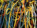
Intermessby rooComment by Annida: ok, i'd be pulling my hair out trying to figure this one out. I like the busy feel in this picture, because it really fits. all the jumble of wires. great. I think you should have diffused the light a bit more to give it a more even feel! great, I like it! |
| 06/11/2003 05:48:08 PM |
|
| 06/11/2003 01:25:05 PM |
|
| 06/11/2003 01:24:25 AM |
|
| 06/10/2003 11:32:03 AM |
Intermessby rooComment by CLarson557: Oh, what a mess! And I thought that the back of MY computer was bad. I like the colors of the wires shown here. I find it interesting to see that there are a lot of them that aren't connected. Unique shot for the challenge. Good luck 7 |
| 06/09/2003 12:01:20 PM |
Intermessby rooComment by Toddh: how many times have I seen this in offices! What a nightmare to sort out! Like the shot it has a real spagettii feel to it. Good luck, Todd. |
| 04/16/2003 12:30:53 AM |
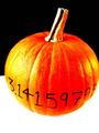
Pumpkin Piby rooComment by indigo997: Hey!
I like the colors! I almost thought this was another color shot.
The black and white really make the orange standout. However, I think there might be a little too much contrast. I think that the color alone would be enough to make the pumpkin "pop" without making it quite so bright. I don't think the lighting was bad... it's just too much contrast. I also think it would be better to have an even amount of space on either side of the pumpkin. It's a bit weird that the right side is cropped.
Cute picture. Good idea. Just a few technical glitches. Still, a score above 5 aint bad! |
| 04/13/2003 04:02:21 PM |
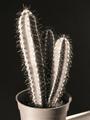
Small, but fierce!by rooComment by draney4: Very simple, I like the lighting and composition, could be abit more sharp, ut it is a very nice picture. |
| 04/13/2003 12:49:11 PM |
Small, but fierce!by rooComment by floyd: Greetings from the Critique Club
The first thing that strikes me about this submission is that it doesn't seem close-up enough to be considered a macro shot. However, I'm reminded that there are some *really* small cactii out there so perhaps this really is a very close up shot of a very small cactus. If so I think you really needed to put something else in-shot to give us the impression of that.
Your lighting on this shot is excellent with a good range of light and dark all across the frame. The light picks out the shapes in the cactus very nicely. The black and white is fine - it adds a little to the stark feeling of the shot which enhances the ferocity of the cactus. Focus seems just a shade too soft. It wouldn't be an issue at all except for those needles that somehow don't look as fearsome as they should. Your composition is fine if a little conventional - that central placement is a little rigid and I'm wondering why I can see a little tabletop in the bottom right. It's fine, I think, to see some table surface but if you're going to show it I think you should show more - in for a penney, in for a pound as they say.
Overall you've taken a technically good shot of a cactus. I think the next step with this shot would be to decide what you're trying to portray and really go all out to capture that aspect of it. If it's a fierce cactus you're trying to show then really let us see those needles. Perhaps even zoom right up to them and fill the frame with needles. If it's a small cactus you're trying to show then really give us the feeling of it being small by putting something larger that we can identify in shot with it.
John Message edited by author 2003-04-13 12:51:01. |
| 04/13/2003 12:00:33 PM |
Pumpkin Piby rooComment by lisae: Interesting. I like the high contrast look and vivid colours. Nice work. |
Home -
Challenges -
Community -
League -
Photos -
Cameras -
Lenses -
Learn -
Help -
Terms of Use -
Privacy -
Top ^
DPChallenge, and website content and design, Copyright © 2001-2026 Challenging Technologies, LLC.
All digital photo copyrights belong to the photographers and may not be used without permission.
Current Server Time: 07/16/2026 05:10:44 AM EDT.