| Image |
Comment |
| 10/30/2005 08:05:16 PM |
|
 Photographer found comment helpful. Photographer found comment helpful. |
| 10/30/2005 07:24:22 PM |
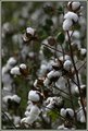
High Cottonby madison461Comment by melodee: this is a great picture. the fields of cotton were beautiful this year but i really like the way you presented this cotton. |
| Photographer found comment helpful. |
| 10/29/2005 10:11:40 PM |
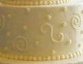
Mmmmmm, cakeby madison461Comment by Chinabun: ok first...light on white. this just shows white, the photo is too close up which makes it appear to be out of focus. if i were to take this photo i wouldve put the cake up against a white BG and photographed the whole thing. merriment |
| Photographer found comment helpful. |
| 10/29/2005 01:28:47 AM |
Mmmmmm, cakeby madison461Comment by scalo: Try moving the midpoint in levels so that the pic is more white. That would fit the challenge better. Also the framing is too tight IMO. |
| Photographer found comment helpful. |
| 10/27/2005 07:11:37 PM |
Mmmmmm, cakeby madison461Comment by Jammur: Why does it seem you can pick out the working wedding photographers?
Tough call here...if you want to think of the curl of frosting as the subject then it works, light on white. However, I'm forced to consider what the title tells me, that is, the cake is the subject, in which case, there's no background. Sorry |
| Photographer found comment helpful. |
| 10/27/2005 01:55:25 PM |
|
| Photographer found comment helpful. |
| 10/26/2005 03:42:31 PM |
Mmmmmm, cakeby madison461Comment by Elaine: This does not have enough of a subject or focus for me, and the whole image appears yellowish-at least on my monitor. |
| Photographer found comment helpful. |
| 10/12/2005 08:42:41 AM |
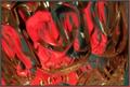
Reflecting Crystal Dreamsby madison461Comment by Neil: I'm not sure I agree that this is "too blurry". As is, I think it has the right ingredients for an abstract. I'd have to see how it came out sharp to see if that was better!
You could play a bit with this shot to possibly make it stronger. Since color is the primary focus of this abstract, perhaps you can try adjusting the white balance or levels so that the crystal does not appear toned (it has a yellow-tan tone on my monitor), and let the shape of crystal alone serve to texture the greens and reds in the background (along with some perhaps stronger greens which can also be adjusted in PS).
This was a good idea! |
| Photographer found comment helpful. |
| 10/11/2005 05:20:45 PM |
|
| Photographer found comment helpful. |
| 10/11/2005 04:22:03 PM |
|
| Photographer found comment helpful. |
Home -
Challenges -
Community -
League -
Photos -
Cameras -
Lenses -
Learn -
Help -
Terms of Use -
Privacy -
Top ^
DPChallenge, and website content and design, Copyright © 2001-2026 Challenging Technologies, LLC.
All digital photo copyrights belong to the photographers and may not be used without permission.
Current Server Time: 07/16/2026 02:10:45 AM EDT.