| Image |
Comment |
| 02/19/2007 04:58:21 PM |
|
| 02/19/2007 04:12:49 PM |
|
| 02/19/2007 12:18:48 PM |
Where to now?by thorgilsComment by gg3rd: Great expression. I like the B&W here. I'd have take out the right side with the card labels, etc.
Image is a bit grainy for my taste: maybe a result of too much USM or cropping too much. |
| 02/16/2007 04:02:57 PM |
|
| 02/15/2007 05:20:55 PM |
|
| 02/13/2007 07:03:41 PM |
|
| 02/13/2007 04:12:51 PM |
without titleby thorgilsComment by Sunshine86: I am sure there is a fitting title for this one. That's pretty diiiirty...BUT-no puns intended-pretty funny. |
| 02/12/2007 07:47:24 PM |
|
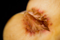
| 02/12/2007 02:39:40 PM |
without titleby thorgilsComment by Alicia: In my opinion, it's too out of focus. If the entire core had been in focus, it might work better. |
| 02/12/2007 12:14:13 PM |
|
Home -
Challenges -
Community -
League -
Photos -
Cameras -
Lenses -
Learn -
Help -
Terms of Use -
Privacy -
Top ^
DPChallenge, and website content and design, Copyright © 2001-2026 Challenging Technologies, LLC.
All digital photo copyrights belong to the photographers and may not be used without permission.
Current Server Time: 05/04/2026 07:22:46 AM EDT.