| Image |
Comment |
| 08/17/2005 04:12:19 PM |
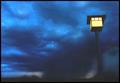
Cloud burstby armelleComment by magnus: Great idea and composition, but difficult lighting. I don't know if careful curve/level adjustment could solve this problem, but the lack of dark tones really bothers me (and the black frame makes it even more obvious that there isn't any pure black in the image). |
 Photographer found comment helpful. Photographer found comment helpful. |
| 08/17/2005 12:29:34 PM |
Cloud burstby armelleComment by e301: There's an odd, almost water-colour-esque feel to this image (not out of place, I suppose). I can see arguments both for and against the inclusion of the lamp-post, but oh, for it to be straight. Colour tones are good, and the sense of greyness, of dullness is well achieved. Without the post, it might have an almost turner-like quality of light about it. |
| Photographer found comment helpful. |
| 08/17/2005 08:15:11 AM |
|
| Photographer found comment helpful. |
| 08/17/2005 07:14:03 AM |
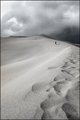
stepping awayby armelleComment by Tallbloke: I like this photo but I feel it's a shame you have lost the colour of the original and have ended up with an almost monotone finished photograph.
The contrast and texture is better in this example in both the sand and the sky. I just wonder if you could have achieved the improved contrast without losing the colour?
I know were only supposed to comment on exposure but excellent composition.
Steve |
| Photographer found comment helpful. |
| 08/16/2005 11:21:22 PM |
Cloud burstby armelleComment by karmat: I like the minimalist feel and the contrast of the yellow light and the blue cloudy sky. |
| Photographer found comment helpful. |
| 08/15/2005 04:44:14 AM |
Cloud burstby armelleComment by ergo: dramatic shot, with balance between light and darkness. I wish there was more definition to the shower part of the image. nice light. 7 |
| Photographer found comment helpful. |
| 08/11/2005 01:54:16 PM |
|
| Photographer found comment helpful. |
| 07/31/2005 07:35:27 PM |
Slidingby armelleComment by Rikki: Too much contrast on this image. The frame is a bit distracting as well because of its width. I do like the curve of the sandhill ridge. It makes for a very dynamic image. IMHO I would probably clone out the two kids to the far left. They're just sitting there and contradicts your title. Just my two cents. |
| Photographer found comment helpful. |
| 07/30/2005 08:46:32 AM |
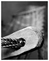
Roped and Twinedby armelleComment by Gauti: excellent use of DOF, just enough of details in the BG to suggest what it is. Cool, now I just want to find one and have a nap :) |
| Photographer found comment helpful. |
| 07/28/2005 10:21:08 PM |
Roped and Twinedby armelleComment by Ivo: Great shot! Good use of DOF without losing the outline of the overall subject. Goodluck! |
| Photographer found comment helpful. |
Home -
Challenges -
Community -
League -
Photos -
Cameras -
Lenses -
Learn -
Help -
Terms of Use -
Privacy -
Top ^
DPChallenge, and website content and design, Copyright © 2001-2026 Challenging Technologies, LLC.
All digital photo copyrights belong to the photographers and may not be used without permission.
Current Server Time: 07/17/2026 08:20:38 PM EDT.