| Image |
Comment |
| 08/17/2005 12:29:39 PM |
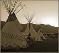
1865 Rendezvouxby rjksteschComment by Nald: Good job Becky on your top 50 finish! I didn't get around to commenting on this during the challenge; I gave you an 8 during voting though. ;-) I love the sepia tones here, and the lines that you captured draw your eye into the shot. Sun rise is a tad burned out. |
 Photographer found comment helpful. Photographer found comment helpful. |
| 08/14/2005 09:24:33 PM |
1865 Rendezvouxby rjksteschComment by ergo: lovely picture. i'm not going to take down for the spelling, but you might want to check it :) nice toning, and the subject matter suits very well. 10 |
| Photographer found comment helpful. |
| 08/14/2005 02:28:56 PM |
|
| Photographer found comment helpful. |
| 08/14/2005 10:06:58 AM |
1865 Rendezvouxby rjksteschComment by macrothing: 4 - Again the quandry, but it's a game and there are rules/guidelines. Definitely a 7 with just the year. And yes, a photo of this put into a time capsule would depict this era for future generations. I like the sepia(?), especially to tie in with the year/era, but I still wonder how well the color would have worked, especially as it likely brought the mountains into play more. edit:typos Message edited by author 2005-12-08 18:34:26. |
| Photographer found comment helpful. |
| 08/14/2005 01:16:31 AM |
|
| Photographer found comment helpful. |
| 08/13/2005 11:22:20 PM |
|
| Photographer found comment helpful. |
| 08/13/2005 11:05:21 PM |
|
| Photographer found comment helpful. |
| 08/13/2005 08:44:36 PM |
|
| Photographer found comment helpful. |
| 08/12/2005 11:56:04 PM |
1865 Rendezvouxby rjksteschComment by ccraft: This is a great composition and a wonderful idea for this challenge. My suggestion (and keep in mind I'm only learning about B&W/Sepia myself) would be to have something almost pitch black and something as white as it comes. With two-tone images, anything with both of these will add a lot to your score - and to the overall image. |
| Photographer found comment helpful. |
| 08/12/2005 11:33:28 PM |
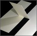
Linen Page with Three Cutsby rjksteschComment by TooCool: This is awesome in it's simplicity! I love it. I had to look at it a couple of minutes to figure out how ya did it! Great lighting. The only thing I would change and it's subtle is to maybe use levels to even out the white board a tad...
Kudos
TC |
| Photographer found comment helpful. |
Home -
Challenges -
Community -
League -
Photos -
Cameras -
Lenses -
Learn -
Help -
Terms of Use -
Privacy -
Top ^
DPChallenge, and website content and design, Copyright © 2001-2026 Challenging Technologies, LLC.
All digital photo copyrights belong to the photographers and may not be used without permission.
Current Server Time: 07/17/2026 03:48:55 AM EDT.