| Image |
Comment |
| 07/12/2005 03:32:05 PM |
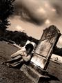
Knightby esdarbyComment by SDW: This is how I would of judged it. I didn't get to vote in this challenge:
Subject Impact: Low
The lack of focal range makes the subject seem noninteresting
Meets Challenge: Average
Because of it's abstract look. without title I would of found it hard to reconize the subject
Technical: Low
Harsh shadows and a very small area of focus. And the focal point does not explain the subject
Composition: Average
Composition would of been high if the technical aspect of the picture would of given us more detail. So I would have to give the composition an average rating
Creativity: Average
An avereage creative shot. You did try to take a macro/close up of something that is not seen in every challenge
Score: 4
Sorry if that sounds harsh but that how I see the picture. Hope it helps. |
 Photographer found comment helpful. Photographer found comment helpful. |
| 07/12/2005 03:26:12 PM |
|
| 07/12/2005 03:24:15 PM |
Judithby esdarbyComment by kawhona: The angle is an interesting one. The sepia tone does go with "gothic" theme of the shot. I think it would have been a more powerful shot more tightly cropped with less of the distractions in the background. |
| 07/12/2005 03:16:01 PM |
Knightby esdarbyComment by LoudDog: I like the crop, colors, lighting and DOF. I think two things held it back in the votong:
1. It's not an extreme macro, you have photos as close as a bugs eye in this challenge, it's hard to compare this to a photo of a bug's eye. I'm sure some people didn't even see it as a macro.
2. Without the title people might not be sure what it is. Maybe a slightly different angle? |
| Photographer found comment helpful. |
| 07/12/2005 01:55:35 PM |
Judithby esdarbyComment by res0m50r: Fit to challenge criteria: 2 /2
Contrast/Colors: 2/2
Photo Quality: 2/2
Composition: 2/2
My subjective affinity: 2/2 |
| 07/12/2005 11:37:42 AM |
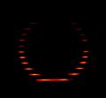
Circle of Fireby esdarbyComment by Man_Called_Horse: We all know what the challenge title is. It is too bad that you could not take the time to be more creative with your titleing.
nice idea, comp good, good movement, good balance, blacks good, whites are not there, overall ho hum |
| 07/12/2005 10:02:07 AM |
Judithby esdarbyComment by Seanachai: nice "dark" take on the challenge. great angle for the shot and toning works too. |
| 07/12/2005 06:39:16 AM |
Judithby esdarbyComment by Shaman: great emotion. not so sure I like this much title, but very good overall - 9 |
| 07/12/2005 05:02:24 AM |
Judithby esdarbyComment by kiwinick: i really can see this image, i wonder how many others appreciate this image, at the moment on this challenge out of the square entries dont seem to be going any where pity 8 |
| 07/12/2005 12:44:04 AM |
Judithby esdarbyComment by jbsmithana: Wow! This shot stopped me in my tracks. Not pretty to look a tbut it has such impact. A 10 in my book. |
Home -
Challenges -
Community -
League -
Photos -
Cameras -
Lenses -
Learn -
Help -
Terms of Use -
Privacy -
Top ^
DPChallenge, and website content and design, Copyright © 2001-2026 Challenging Technologies, LLC.
All digital photo copyrights belong to the photographers and may not be used without permission.
Current Server Time: 07/17/2026 02:56:28 AM EDT.