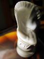
DPChallenge: A Digital Photography Contest You are not logged in. (log in or register
 
Browse Settings
Currently viewing:
Registered Useresdarby

Show comments:

Per page:

Order:

Comments:


Comments Received by esdarby
Pages:   ... [109] [110] [111] [112] [113] [114] [115] ... [122]
Showing 1111 - 1120 of ~1211
Image Comment
Judith
07/15/2005 05:27:17 PM
Judith
by esdarby

Comment by RKT:
IMO It all seems a bit contrived...the gothic sepia, the slant, the "despair" which really doesn't ring true due to the age of the model paired with the age of that grave stone...maybe if it were a newer stone the sadness might be more believable, but then again most new stones are a bit boring.
Judith
07/15/2005 12:06:54 PM
Judith
by esdarby

Comment by bcoble:
Touching.
Judith
07/15/2005 06:56:19 AM
Judith
by esdarby

Comment by roadrunner:
weather their here or passed they are still family... well excecuted.. love the tones...
Judith
07/14/2005 01:56:02 PM
Judith
by esdarby

Comment by Floffy:
I like it very much
Judith
07/14/2005 12:58:23 PM
Judith
by esdarby

Comment by darkornithopter:
this is a beautiful photograph, I love the emotion. Great interpritation of the challenge.
Judith
07/14/2005 02:19:03 AM
Judith
by esdarby

Comment by Art Roflmao:
Please forgive me if I am wrong, but this loks like an obvious staged shot - the problem here is that you are trying to convince the viewer that the person is mourning over the deceased person, but the headstone is so obviously waaaay old that it doesn't fit together and that jumps out right away.
Judith
07/13/2005 07:08:02 PM
Judith
by esdarby

Comment by thebext:
Outstanding photo! Having it tilted like that really adds impact to the sadness....The threatning sky also adds to the feeling.....very well done!
Knight
07/13/2005 05:36:21 PM
Knight
by esdarby

Comment by Jewellian:
I liked this pne pretty well, gave it a 6, I thought it would have been better with just a tad more DOF, to get a little more of the head in focus. Also a more solid background would have probably helped a bit.
Knight
07/13/2005 05:31:49 PM
Knight
by esdarby

Comment by savannahjames:
I love to take photos at odd angles, so I can appreciate your composition here. However, it seems that you're wanting the eye of the knight to be what you see first (I say that because it's the part in clearest focus), something which is difficult at that angle with this knight. First, most people will look slightly to the left and slightly above the center of your photo. Therefore, that is a good place to put the focal point of your subject - people decide very quickly whether they like or dislike a photo, and the very first impression is the most important. You have to catch their eye before they'll look at the rest of the photo at all. I would try taking the photo again and try putting the knight on the left rather than the right.

Second, to be honest, it's not the most attractive-looking chess piece I've ever seen. You could retake this picture - same lighting, same background, same focus - but with a knight from a completely different set, and the whole mood of the photo would change.

Like I said, I love odd angles, especially of common items that most people wouldn't give a second glance at. Just keep experimenting with different angles, different focus points, different pieces, etc. It's all in having fun with it.

I hope this helps! If you retake the shot, I'd love to see the results. Just PM me and let me know. :o)

~SavannahJames
Knight
07/13/2005 05:28:37 PM
Knight
by esdarby

Comment by Pixelstate:
Well, you asked for feedback... I can't add much that hasn't been said... this looks like a potentially promising subject but somehow your picture just doesn't work. It certainly is a Macro, but I understand the 5's middle of the road voting.

3 is too low for this entry (IMO) as it is in focus and meets the challenge... bonus points because it is not a shot of a bug! :-)

So what is wrong:

Awkward angle
Cropping too tight
background distracts.. (what's wrong with a chess board?)

It is just not interesting enough to jump a vote or two... I think that technique is pretty sound, and I like the dappled natural light.
Pages:   ... [109] [110] [111] [112] [113] [114] [115] ... [122]
Showing 1111 - 1120 of ~1211


Home - Challenges - Community - League - Photos - Cameras - Lenses - Learn - Help - Terms of Use - Privacy - Top ^
DPChallenge, and website content and design, Copyright © 2001-2025 Challenging Technologies, LLC.
All digital photo copyrights belong to the photographers and may not be used without permission.
Current Server Time: 08/24/2025 03:24:42 AM EDT.