| Image |
Comment |
| 12/09/2003 06:53:26 PM |
|
| 12/08/2003 04:50:37 PM |
Tapped Outby ambakerComment by PTLParsons: Good focus and meets challenge. Can't tell what the blue thing is that the cards are in.The background is not one color: bottom right hand corner is white; bottom left hand corner is yellowish (appears to be a shadow); the rest of the background appears to be a grey shade. |
 Photographer found comment helpful. Photographer found comment helpful. |
| 12/07/2003 01:06:58 AM |
Tapped Outby ambakerComment by Katspetkat: Wow, how do you keep all those straight? Like the wallet and all that, but there seems to be a bit more white than anything else, maybe spread them out and smug out the info on the cards? |
| Photographer found comment helpful. |
| 12/05/2003 01:36:15 PM |
|
| 12/05/2003 11:41:58 AM |
|
| Photographer found comment helpful. |
| 12/05/2003 02:13:06 AM |
Tapped Outby ambakerComment by ogdenm: The lighting is uneven and there is a strange refelction - probably from the hologram. There are two lines or hairs in the image. With a setup there is just no excuse for not having things perfect. |
| Photographer found comment helpful. |
| 12/04/2003 08:15:06 PM |
Tapped Outby ambakerComment by ahaze: Technical: Fits the challenge. Exposure is okay, seems a little dark in some places and too hot in others. Well composed, though the line behind the wallet (is that another sheet of paper?) is distracting. Good focus. More even and diffuse lighting would have helped the exposure. Are you spotlighting the empty part of the wallet where cash would go? Good idea, but I don't think it translates as well as it could.
Personal: I like the idea very much. A little more attention to detail would have made this great.
My vote: 6 |
| Photographer found comment helpful. |
| 12/04/2003 06:16:30 PM |
|
| Photographer found comment helpful. |
| 12/03/2003 09:17:28 PM |
Tapped Outby ambakerComment by justine: Love the title and the final notice text. The problems are the lighting and the perspective view of the wallet. Your color is good. Keep trying. Good luck. |
| Photographer found comment helpful. |
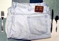
| 11/23/2003 03:47:28 PM |
Eat My Shortsby ambakerComment by tomlewis1980: The whole shot looks a little over exposed and the angle at which the shot was taken offers little perspective making it look flat and lifeless. |
| Photographer found comment helpful. |
Home -
Challenges -
Community -
League -
Photos -
Cameras -
Lenses -
Learn -
Help -
Terms of Use -
Privacy -
Top ^
DPChallenge, and website content and design, Copyright © 2001-2026 Challenging Technologies, LLC.
All digital photo copyrights belong to the photographers and may not be used without permission.
Current Server Time: 07/17/2026 05:01:38 AM EDT.