| Image |
Comment |
| 01/23/2003 12:54:02 AM |
|
 Photographer found comment helpful. Photographer found comment helpful. |
| 01/23/2003 12:45:16 AM |
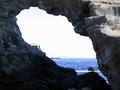
Portalby AntithesisComment by sulamk: Greetings from the Critique Club
I like the way that you have used the portal to frame this seascape but the dark rock at the front has fooled your cameras metering system into overexposing the sky whilst exposing the rock in foreground almost perfectly, the foreground at the bottom could have been a little brighter. I would have liked to see some obvious focal point on the other side of the portal drawingthe viewer into the scene on the other side. Colour and saturation very good other than the sky, the sea is a glorious colour!
The focus is good.
Suggestions for improvement
Try bracketing the shot if you have this option on your camera also a lower apeture and higher iso might help. |
| Photographer found comment helpful. |
| 01/22/2003 11:01:16 PM |
|
| 01/22/2003 05:49:12 PM |
|
| Photographer found comment helpful. |
| 01/22/2003 04:40:23 PM |
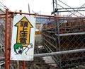
OMG!! Caution: Above!!!by AntithesisComment by Lustre: I love the sign, or should I say "OMG, What a funny sign". Composition is fairly good - it's a shame you couldn't get a crane in the background somehow. Focus is also pretty good. |
| Photographer found comment helpful. |
| 01/22/2003 03:21:00 PM |
|
| Photographer found comment helpful. |
| 01/20/2003 08:55:07 PM |
OMG!! Caution: Above!!!by AntithesisComment by dodobird: Just too too funny. Great idea for a sign. The focus is good and crisp and the background doesn't detract but adds to the feel of the sign. The only problem I am having is the angle of the shot. The sign is on an angle leaning the right, the scaffolding is leaning left, and camera doesn't follow either. I wonder ehat it might have looked like with the sign perpendicular which would have the scaffolding kinda leaning and ready to fall on the sign. Just a thought. 8. |
| Photographer found comment helpful. |
| 01/20/2003 07:41:54 PM |
|
| Photographer found comment helpful. |
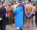
| 01/20/2003 07:18:30 PM |
Alright, Who's Got the Hot Milk?!!by AntithesisComment by HBunch: Maybe I'm missing the Dairy product in your photo. I looked for it, I really did. The shot as a whole is ok. Nice colors and focus. The angle and framing/cropping could use some attention though. You cut off heads and feet. Is the guy in the red undies your main subject? If so, you might have tried a vertical crop. Right now, the blue coat is taking up most of the space in your photo. Sorry for not seeing how this meets the challenge. Good luck. |
| Photographer found comment helpful. |
| 01/20/2003 07:08:03 PM |
|
| Photographer found comment helpful. |
Home -
Challenges -
Community -
League -
Photos -
Cameras -
Lenses -
Learn -
Help -
Terms of Use -
Privacy -
Top ^
DPChallenge, and website content and design, Copyright © 2001-2026 Challenging Technologies, LLC.
All digital photo copyrights belong to the photographers and may not be used without permission.
Current Server Time: 07/17/2026 12:31:32 AM EDT.