| Image |
Comment |
| 06/26/2003 05:49:06 PM |
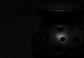
Incenseby AntithesisComment by dacrazyrn: I would like to see a touch more lighting on this. I would like to be able to make out a little more of what it is around the left side. Good detail in the area that has the "most" amount of light though |
| 06/26/2003 02:07:34 PM |
Incenseby AntithesisComment by dsidwell: The lighting you do have here defines the holes of the object, but I'm still not sure what it is. Perhaps it's too low key! Oh well. Maybe a wisp of smoke would help? The off center composition seems effective at helping this object appear to be in a larger space. |
| 06/25/2003 08:27:33 PM |
Incenseby AntithesisComment by sher: i love this! just enough light to still see some detail. great work! |
| 06/24/2003 02:41:45 PM |
Incenseby AntithesisComment by Imagineer: I think the lighting is a bit flat. It may have looked better and more intriguing with directional lighting, revealing the unusual form of the container. [6] |
| 06/22/2003 08:25:46 AM |
Incenseby AntithesisComment by DennisF: Good potential in the subject. I think blacker background and side lighting would have made this a better shot. |
| 06/22/2003 12:36:53 AM |
Incenseby AntithesisComment by Firstrich1: adjusting my screen made this work for me I had you at a lower number but made another pass....I spent some time reading forums and feel a lot of us got tagged for issues out of our hands...anyway nice job! 8 |
| 06/20/2003 06:26:34 PM |
Incenseby AntithesisComment by Sonifo: This does meet the challenge but not very interesting. Way to much black going on here. A little more light would help. Good luck |
| 06/20/2003 12:43:47 PM |
Incenseby AntithesisComment by ChrisW123: It's so dark I can't tell what it is. And I'm pretty sure my monitor is set correctly. :( |
| 06/20/2003 07:05:13 AM |
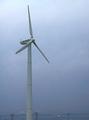
EcoLivingby AntithesisComment by Antithesis: Thanks to everyone who looked. I included the power lines because it was so relevant to the topic of power. Maybe as an individual photo the power lines should be excluded, but for this magazine cover I thought they should stay. And I agree that the sky really sucked, but I was power-less to change it at the time.
Thanks again for your input. Message edited by author 2003-06-20 07:09:34. |
| 06/17/2003 11:46:19 AM |
|
Home -
Challenges -
Community -
League -
Photos -
Cameras -
Lenses -
Learn -
Help -
Terms of Use -
Privacy -
Top ^
DPChallenge, and website content and design, Copyright © 2001-2026 Challenging Technologies, LLC.
All digital photo copyrights belong to the photographers and may not be used without permission.
Current Server Time: 07/16/2026 07:59:39 AM EDT.