| Image |
Comment |
| 06/19/2012 09:39:45 PM |
|
 Photographer found comment helpful. Photographer found comment helpful. |
| 06/19/2012 03:51:12 PM |
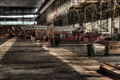
Former Gloryby MarkBComment by RyanW: definitely gives the feeling of an outdated piece of equipment that has been left behind for "bigger and better". For all we know, this whole building was the old firehouse and is as abandoned as the truck it still houses.
biggest drawback for the abandoned theme is the wood in the lower left corner - it looks too 'new' to have been abandoned with the building in the state it's in - it looks like it's about to receive an overhaul to the premesis.
still, a great image for the building/truck in feeling their disrepair/abandonment |
| Photographer found comment helpful. |
| 06/19/2012 09:53:12 AM |
|
| Photographer found comment helpful. |
| 06/18/2012 12:47:24 PM |
|
| Photographer found comment helpful. |
| 06/17/2012 01:13:28 PM |
|
| Photographer found comment helpful. |
| 06/15/2012 11:17:50 AM |
May15by MarkBComment by eschelar: Probably my favorite studio type setup in this series, but I'm seeing some very strange, almost posterization-like effects in your lower face. That's not at all a bad thing, and actually, a bit of an oil brush look would make this quite compelling on a business card. Especially with your hair style.
It seems to me that your self portraits seem to have a bit of awkwardness as to what to do with the shoulders. I read a really good article once about the details of classic portraiture and posing. I've forgotten most of it and seldom follow it, but it might be something that will give you some tools to have a bit more control over this feature of your poses. I think it's the fact that you have dropped your shoulder a tiny bit too much in a few shots, which puts you a bit off-kilter. It is barely noticeable in this pic due to the close crop, which is probably why I like it. Squaring the shoulders would make a more 'masculine' pose, dropping the shoulder gives a more 'sensitive' pose. This might be exactly what you wanted to show of yourself in this pic though, so then it would not be a negative feature.
As usual, your lighting is excellent. Message edited by author 2012-06-15 11:21:14. |
| 06/15/2012 11:12:25 AM |
May10by MarkBComment by eschelar: It's got some good personality in it. The most interesting in your series by far. The face looks a tiny bit washed out, but that might be part of the intended style, and I'm wondering what you're doing with that bag of potato chips (just got caught cheating on your diet?), but nicely laid out and nicely presented.
I think your strength is in your sense of how to use negative space. |
| 06/15/2012 11:06:19 AM |
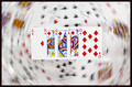
Royally Flushedby MarkBComment by eschelar: Great idea and nicely executed. I think what really makes this work is the balance of light between the cards in the foreground and the cards in the background. It helps the front cards really stand out.
Excellent. |
| Photographer found comment helpful. |
| 06/14/2012 01:43:44 PM |
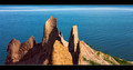
Erosionby MarkBComment by RyanW: that rock on the right has it coming. it's already got a few drops on it.
DEAR GOD, THE TRAVESTY!! IT'S ERODING BEFORE OUR EYES!!!!
(trying to comment on all, sorry if my wit is not up to par) |
| 06/13/2012 05:00:21 PM |
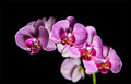
ORCHID FOR SHEZby MarkBComment by MarkB: THANK YOU
Originally posted by sherpet:

HERE IS A  SHERPET AWARD FOR YOU FOR ENTERING THE DPCHALLENGE 24 HOUR SPEED CHALLENGE CALLED 'FLOWERS FOR SHERPET'. SHERPET AWARD FOR YOU FOR ENTERING THE DPCHALLENGE 24 HOUR SPEED CHALLENGE CALLED 'FLOWERS FOR SHERPET'. |
|
Home -
Challenges -
Community -
League -
Photos -
Cameras -
Lenses -
Learn -
Help -
Terms of Use -
Privacy -
Top ^
DPChallenge, and website content and design, Copyright © 2001-2026 Challenging Technologies, LLC.
All digital photo copyrights belong to the photographers and may not be used without permission.
Current Server Time: 06/23/2026 05:53:25 AM EDT.