| Image |
Comment |
| 03/28/2013 10:31:03 AM |
|
 Photographer found comment helpful. Photographer found comment helpful. |
| 03/27/2013 10:10:48 AM |
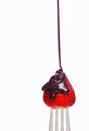
Drizzledby MarkBComment by Damon: that says more like yummy than sugar, :) but I still like it. Actually made my mouth water a little |
| Photographer found comment helpful. |
| 03/26/2013 08:31:39 PM |
|
| 03/20/2013 04:25:51 PM |
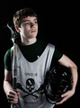
Bring it Onby MarkBComment by Judi: What lost it for me was the focus....it should have been on the face, not his fist. That would have made a huge difference. :) |
| Photographer found comment helpful. |
| 03/20/2013 11:04:13 AM |
Bring it Onby MarkBComment by Mike: the light is too hot, contrast is too strong, its hard to pull out the details of the mask and lacrosse stick. the shirt blends in to the black and as a result the head is floating.
also, eye contact. im not a big fan of staring out into space, sometimes its works but not here.
it also would have benefited greatly from a hair light or small fill on the camera right behind the subject to give him "some" separation from the background. |
| Photographer found comment helpful. |
| 03/20/2013 10:54:28 AM |
Bring it Onby MarkBComment by Garry: Tehcnically, I think its very well done. Lighting and pose and composition, to me, are all pretty good. I just didn't "connect" in any emotional way to the image to vote it higher than the 7 I gave. Its lacking something. Now, what that something is, I don't know. Drama? |
| Photographer found comment helpful. |
| 03/20/2013 10:34:11 AM |
Bring it Onby MarkBComment by Spork99: I can't add much to what's been said already. The lighting on the subject's right is too strong, the left side of his hair and the black part of his uniform have melted into the black BG and the main light is emphasizing the jersey, not his face. The pose is OK, but I don't feel qualified to offer advice there. I think the crop here is a bit too tight, but it's not terrible. Message edited by author 2013-03-20 10:34:24. |
| Photographer found comment helpful. |
| 03/20/2013 09:50:03 AM |
Bring it Onby MarkBComment by vawendy: I'm quite surprised at the score -- I thought it was beautifully done and gave it an 8. Jenn's right, and the lighting could have been brighter on the face than on the side, but it didn't bother me. :) Message edited by author 2013-03-20 09:50:43. |
| Photographer found comment helpful. |
| 03/20/2013 09:49:51 AM |
Bring it Onby MarkBComment by sjhuls: Overall the tone is too cool, and he needs some backlighting to make him stand out from the background. Overall the lighting is pretty good but you missed a bit and the jersey and his arms are better lit than his face, so the emphasis goes to those areas instead of the face. One thing to always ask yourself when doing a portrait is: "do my eyes go to his eyes and face first?" if not it's a miss. With this my eyes go to the jersey first. |
| Photographer found comment helpful. |
| 03/18/2013 01:40:37 AM |
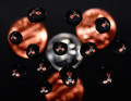
Falling Apartby MarkBComment by shahul: Beautiful Textures!!! The retina color seems like spreaded more outside than the blown out little place which causes little imbalance. |
| Photographer found comment helpful. |
Home -
Challenges -
Community -
League -
Photos -
Cameras -
Lenses -
Learn -
Help -
Terms of Use -
Privacy -
Top ^
DPChallenge, and website content and design, Copyright © 2001-2026 Challenging Technologies, LLC.
All digital photo copyrights belong to the photographers and may not be used without permission.
Current Server Time: 06/23/2026 11:28:02 AM EDT.