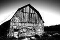
DPChallenge: A Digital Photography Contest You are not logged in. (log in or register
 
Browse Settings
Currently viewing:
Registered Useracrotide

Show comments:

Per page:

Order:

Comments:


Comments Received by acrotide
Pages:   ... ...
Showing 411 - 420 of ~485
Image Comment
Calmness of the Mighty Wind
08/03/2006 08:38:43 AM
Calmness of the Mighty Wind
by acrotide

Comment by timfythetoo:
Nice and simple. Fits the challenge well. Good work.
Photographer found comment helpful.
Calmness of the Mighty Wind
08/01/2006 07:49:25 PM
Calmness of the Mighty Wind
by acrotide

Comment by sevilduvarci:
nice minimalist composition.
Photographer found comment helpful.
Calmness of the Mighty Wind
08/01/2006 02:33:36 PM
Calmness of the Mighty Wind
by acrotide

Comment by Elaine:
I love the simplicity of this shot.
Photographer found comment helpful.
Calmness of the Mighty Wind
08/01/2006 02:24:02 PM
Calmness of the Mighty Wind
by acrotide

Comment by glad2badad:
On the border of losing the impact with this high-key approach I think. Certainly a nice approach and I like the simple composition. Looks like there are some nice colors available that could pop a bit more. JMO of course. Good luck.
Photographer found comment helpful.
Calmness of the Mighty Wind
07/31/2006 08:41:27 PM
Calmness of the Mighty Wind
by acrotide

Comment by theyetifanclub:
I like the over exposed-ness but I think you should have uped the saturation on the wheat stuff, oh and it's out of foucus
Photographer found comment helpful.
Calmness of the Mighty Wind
07/31/2006 07:55:16 PM
Calmness of the Mighty Wind
by acrotide

Comment by Karalew:
Very neat and artistic
Photographer found comment helpful.
B&W High Contrast
07/29/2006 10:59:06 AM
B&W High Contrast
by acrotide

Comment by levyj413:
First, thanks for the terrific explanation and links to the other shots! That's a terrific tool for helping others follow along.

I think this particular photo is a great example of what the various versions do for you. Of course, you start from a nicely composed, nicely exposed, nicely focused shot. Let's not forget the fundamentals here.

Here's my reaction to each shot:

Color: an old barn, but not especially decrepit. It's a nice day, enjoying some time in the country. Emotion: calm, happiness, generally enjoying life. It might benefit from some higher contrast, but not to extremes. Details I'm drawn to: the shape of the barn against the sky, a little texture in the barn, the hay bales.

Initial B&W: kind of bland; while in the color version the sky contrasted with the barn and the ground, here they all kind of blend together. Emotions: tired, end of day, ready to go home. I notice the sky darkening in a way I didn't in the original, which suggests the end of the day to me. I realize intellectually that it's just the usual sky lightening near the horizon, but emotionally, that's the effect. Details I'm drawn to: not much, actually. Mostly the shadow line under the roof.

High contrast B&W: ZAP! I immediately zoom in on the textures in the wood, the way the loft door stands out against the grain, and how the main door is falling off its hinges. The sky seems ominous now. The hay bales fade out of view. The barn's upper wood stands out against the lower stones. I wonder what's hidden in that shadow on the left and over in the very dark woods. Emotions: a little afraid, like the barn's probably haunted. And the sky makes me worry a storm's coming. Finally I feel a little sad for this barn that's falling apart.

I'm not saying the high contrast version is better than the color version, necessarily. It just conveys different things, and the high contrast version affects me more strongly. The initial B&W is definitely the "tamest" of the three, and wouldn't hold my interest for very long.
Photographer found comment helpful.
B&W High Contrast
07/29/2006 09:58:04 AM
B&W High Contrast
by acrotide

Comment by Melethia:
This worked out pretty well as a high contrast shot even though it wasn't taken as such. Thanks for sharing your steps!
Photographer found comment helpful.
B&W High Contrast
07/29/2006 08:56:27 AM
B&W High Contrast
by acrotide

Comment by Jaded_Housewife:
Great Job illustrating the progression of your processing. i'm not good at that. cant figure out the screen shots either. I don't however like the way the roof looks anymore but I love the rest of it. maybe mask of the roof a little? The original does have a little detail. some lines on it. just a thought.
Photographer found comment helpful.
Layers
07/22/2006 10:39:51 PM
Layers
by acrotide

Comment by neophyte:
I really like the lighting on this one as well as the comp. Reflection from the flash is a bit much but all in all a nice photo.
Photographer found comment helpful.
Pages:   ... ...
Showing 411 - 420 of ~485


Home - Challenges - Community - League - Photos - Cameras - Lenses - Learn - Help - Terms of Use - Privacy - Top ^
DPChallenge, and website content and design, Copyright © 2001-2025 Challenging Technologies, LLC.
All digital photo copyrights belong to the photographers and may not be used without permission.
Current Server Time: 08/24/2025 10:14:30 PM EDT.