| Image |
Comment |
| 06/28/2011 09:33:28 AM |
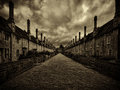
Vicars’ Closeby james_soComment by Qiki: If I had to be critical I'd say it looks just a little dark, but that could be my monitor. All in all tho, a great shot that is enhanced by the sepia, rather than looking like and afterthought just to meet the challenge. Front page? Oh, and at the risk of being pedantic, should it be Vicar's Close? |
 Photographer found comment helpful. Photographer found comment helpful. |
| 06/27/2011 08:49:12 AM |
|
| Photographer found comment helpful. |
| 06/27/2011 02:46:24 AM |
|
| Photographer found comment helpful. |
| 06/27/2011 12:40:11 AM |
|
| Photographer found comment helpful. |
| 06/27/2011 12:34:44 AM |
|
| Photographer found comment helpful. |
| 06/22/2011 10:20:16 PM |
|
| Photographer found comment helpful. |
| 06/21/2011 11:21:56 PM |
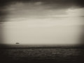
Teardropby james_soComment by adigitalromance: This is a cool photo. I like the border and the contrast, and I get the message. I'm just not sure if the *excitement* is there for me. |
| Photographer found comment helpful. |
| 06/21/2011 09:46:04 PM |
|
| Photographer found comment helpful. |
| 06/19/2011 04:43:37 PM |
Teardropby james_soComment by Revecca: I like how well the textures stand out. I think your frame takes away from this image because it makes it very bright. IMHO, an all black frame would've made a bolder look. |
| Photographer found comment helpful. |
| 06/18/2011 10:45:21 PM |
Teardropby james_soComment by Garry: Lovely tones, textures and colors. One of my top 5 images in this challenge. Very nice! |
| Photographer found comment helpful. |
Home -
Challenges -
Community -
League -
Photos -
Cameras -
Lenses -
Learn -
Help -
Terms of Use -
Privacy -
Top ^
DPChallenge, and website content and design, Copyright © 2001-2026 Challenging Technologies, LLC.
All digital photo copyrights belong to the photographers and may not be used without permission.
Current Server Time: 07/28/2026 06:59:05 AM EDT.