| Image |
Comment |
| 07/19/2004 02:27:31 PM |
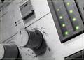
Balanceby tlalondeComment by kostia: the green border is distracting. something slightly rougher, if you must use a border, might have fit better with the rough/used appearance of the stereo. also, having the lights be the only color in the image gives it a nice black and white feel. the border takes that away. |
| 07/19/2004 01:01:28 AM |
Balanceby tlalondeComment by MAK: i did something similar to this I was wondering how many would pick up on it. nice pic and i like the way u chose an old system rather than a nice new one.. good job |
| 07/19/2004 12:17:46 AM |
|
| 08/23/2003 11:38:52 PM |
|
| 08/23/2003 11:34:42 PM |
|
| 07/27/2003 04:21:15 PM |
Untitledby tlalondeComment by kiwiness: I thought I'd see more piano shots but this is nearly the only one! Very good I like it. Message edited by author 2003-07-28 03:47:52. |
| 07/26/2003 11:16:27 PM |
Untitledby tlalondeComment by crabappl3: What makes this a nice piano shot is the texture in the keys! I have seen many a keys, but this one in it's orientation and the texture bring this together to be a nice abstract piece of art. 9 -danny |
 Photographer found comment helpful. Photographer found comment helpful. |
| 07/26/2003 02:35:06 PM |
Untitledby tlalondeComment by dsidwell: Super idea. Seems just a tad *muddy*. Perhaps more contrast would help with clarity? Perhaps whiter whites and blacker blacks? Hmmm. I love the composition and angle of framing. |
| Photographer found comment helpful. |
| 07/25/2003 05:18:52 PM |
|
| 07/25/2003 01:20:33 PM |
|
| Photographer found comment helpful. |
Home -
Challenges -
Community -
League -
Photos -
Cameras -
Lenses -
Learn -
Help -
Terms of Use -
Privacy -
Top ^
DPChallenge, and website content and design, Copyright © 2001-2026 Challenging Technologies, LLC.
All digital photo copyrights belong to the photographers and may not be used without permission.
Current Server Time: 07/18/2026 05:34:33 AM EDT.