| Image |
Comment |
| 04/06/2006 09:30:30 AM |
[ WELCOME STRANGER ]by gocComment by smyk: I like the shot. i like the simplicity but, maybe this has laready ben said, i would have put the whole "circle" in the frame. that 's just me though ;) |
 Photographer found comment helpful. Photographer found comment helpful. |
| 04/05/2006 11:04:10 PM |
|
| Photographer found comment helpful. |
| 04/05/2006 06:44:15 AM |
|
| Photographer found comment helpful. |
| 04/05/2006 02:19:49 AM |
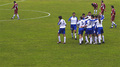
white/blue winners | red/red loozersby gocComment by Leok: The concet is good but the players are a bit lost in all that green. For bigger impact a crop or zoom on the winning players expressions would have worked better, even just the top right corner of this pic would be an improvement..
Having dejected looking players from team red is a good idea too... but again facial expressions in a closer crop would help! |
| Photographer found comment helpful. |
| 04/04/2006 09:26:04 PM |
white/blue winners | red/red loozersby gocComment by jdannels: its a good picture, but i think the title should not have been so exact as to what the photo is. and maybe cropping out far right red guy and making the photo a long panoramic with the red player on the far left and bottom cropped just to the feet so that the only empty space is between the winners and losers are so that all dead space is only between red and blue team. just a thought though. |
| Photographer found comment helpful. |
| 04/04/2006 12:51:01 PM |
|
| Photographer found comment helpful. |
| 04/03/2006 10:53:34 PM |
|
| Photographer found comment helpful. |
| 04/03/2006 07:20:06 PM |
|
| Photographer found comment helpful. |
| 03/31/2006 10:59:53 PM |
|
| 03/31/2006 10:37:04 PM |
|
Home -
Challenges -
Community -
League -
Photos -
Cameras -
Lenses -
Learn -
Help -
Terms of Use -
Privacy -
Top ^
DPChallenge, and website content and design, Copyright © 2001-2026 Challenging Technologies, LLC.
All digital photo copyrights belong to the photographers and may not be used without permission.
Current Server Time: 07/17/2026 08:57:28 AM EDT.


![[ WELCOME STRANGER ]](https://images.dpchallenge.com/images_challenge/0-999/459/120/Copyrighted_Image_Reuse_Prohibited_303320.jpg)