|
|
|
Showing 1361 - 1370 of ~1561 |
| Image |
Comment |
| 05/09/2006 06:24:17 AM | |  Photographer found comment helpful. Photographer found comment helpful. |
| 05/09/2006 03:09:42 AM | | | Photographer found comment helpful. |
| 05/09/2006 01:02:30 AM | alena.jpgby margiemuComment by fotomann_forever: This one is a lot better, technically. Focus is sharp, color is better and Dof works better here. Even the lighting is better.
I do prefer the action captured in the other better, but this would have scored much better for you. | | Photographer found comment helpful. |
| 05/09/2006 12:44:55 AM | Snohomish Invitational GU-13 Finalsby margiemuComment by fotomann_forever: First Impression - the most important one:
It's a nice action shot, you've caught the play of the game well, but some technical details, such as a bit soft focus is distracting.
Composition:
The crop works well, this is a typical composition for a newspaper shot. The fence line at the very top is a bit distracting though. Also, DoF is quite deep. I'd like to see a bit shallower depth of field to blur the background. This would help with my earlier comment of the people and also my issue with the fence line.
Subject:
Subject matter was good for this challenge. Almost any photog that has ever worked for a newspaper has shot sports. So, I think you made a good choice.
Technical (Color, focus, and light):
Focus issues, I feel hurt you the most.
Color is ok, but not vivrant. Playing with curves (or at least boosting saturation) would definitely add points.
Sports shots are tough when it comes to lighting and yours is not bad, considering the dynamic range it had to cover (black and white uniforms).
From a photojournalism standpoint
Minus the focus issues (which may be able to be fixed with USM) this shot would run in most small local newspapers easily. You could do these with a litle practice. But, try more with the longer lens, the DoF and being able to reach into the game will give you more of what viewers and editors are used to seeing.
Well, I hope this helps. I hope to see more from you in the future. :-)
Leroy Message edited by author 2006-05-09 00:45:18. | | Photographer found comment helpful. |
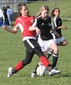
| 05/08/2006 11:40:41 PM | Snohomish Invitational GU-13 Finalsby margiemuComment by blackenedwhite: From the CTP MkII
Disclaimer: The following crits are personal opinions, not photographic dogmas. Please see them as suggestions, not claims of mastery nor a show of hauteur.;p
First Impression: Wow, girlie football. However, a 4 from me (sorry...-_-") as the colors are a bit washed out and the shot lacks punch.
Composition: 5. The action's nice, but the background's too distracting it takes a lot from the shot. Hey, at least the ball's there.
Subject: 6. Girlie soccer's cool, but I'm not too wild over it. You got the action, which MAKES the shot, so that's cool. Digressing, the chick in red looks a wee bit like a dude, IMO. Sorry...
Technical: 4. Focus is a bit off, coloure a bit washed out, exposure a bit over-, um, exposed, and, well, the whole thing's a bit flat -- which you, however, could improve with pp. Well, a lot of pp.
Improvement: Recompose, maybe from another lateral and/or higher angle. Also, a lot of pp: a wee bit of dodging and burning, levels maybe or curves, saturate, and sharpen.
Summary: I hope I didn't sound too harsh. It's a good shot... it only needs some refinement. I'm a number too short on screws in the head so please do not be offended.;p Message edited by author 2006-05-08 23:41:52. | | Photographer found comment helpful. |
| 05/08/2006 08:45:53 PM | Snohomish Invitational GU-13 Finalsby margiemuComment by Rebecca: Hello margiemu! Here's your CTP2C
Compositionally, I think action shots are difficult, so kudos for getting a fairly decent shot. The players' faces and the action are all clearly visible. The group in the upper left background is a distraction, however, particularly since they don't seem too interested in what's going on.
The shot is a bit too blurred, especially surprising to me since it looks overexposed. I think both could be addressed in post-processing with some contrast, turn the brightness down a notch or two, a turned up the yellow in highlights w/ color balance, a little burn in an adjustment layer, plus a bit of unsharp mask:
 | | Photographer found comment helpful. |
| 05/08/2006 07:12:07 PM | | | Photographer found comment helpful. |
| 05/08/2006 06:46:19 PM | Driving People Crazyby margiemuComment by Matthew: Not quite sure how film posterish this image is, and it does not have a strong aesthetic quality. People in the background are distracting. | | Photographer found comment helpful. |
| 05/08/2006 03:02:14 PM | Snohomish Invitational GU-13 Finalsby margiemuComment by Gunnsi: Comment from a member of your own commenting club :-)
Nice picture of girl socker but you could have made it better.
1. The title isn't catchy.
In this competition you could just as well made it up f.x.:
"Reds won the Golden Cup again" :-)
2. The two girls are a bit blurry, selective contrast would maybe have done it better. The third girl is ok.
3. The women in the back go into my nervs. Seeing people waching kid sport and at the same time not paying any attention make me somehow angry. The picture without them would have been much better.
4. The colours are not as strong as they could have been. I am no expert but I know there is a way to make them stronger in Advanced editing.
What is good in this picture is:
1. The girls are wery determent and you captured that well.
2. Cropping is good.
3. Good leading lines.
Hope I do not sound harsh. Message edited by author 2006-05-10 20:24:48. | | Photographer found comment helpful. |
| 05/08/2006 02:05:57 PM | | | Photographer found comment helpful. |
|
Showing 1361 - 1370 of ~1561 |
Home -
Challenges -
Community -
League -
Photos -
Cameras -
Lenses -
Learn -
Help -
Terms of Use -
Privacy -
Top ^
DPChallenge, and website content and design, Copyright © 2001-2026 Challenging Technologies, LLC.
All digital photo copyrights belong to the photographers and may not be used without permission.
Current Server Time: 06/26/2026 01:19:14 PM EDT.
|