| Image |
Comment |
| 05/12/2006 08:02:43 PM |
clara and brienne.jpgby margiemuComment by CEJ: The crispness and clarity of this photo is superb. It appears a bit over sharpened, but not so much that it becomes a distraction. it appears a bit bright. It also appears that a bump up in contrast would help to define the light and dark areas as well as emphasizing their presence. The crop is good and the DoF is good. You have captured their expressions well and the pose/composition is good.
Just a quickie... |
 Photographer found comment helpful. Photographer found comment helpful. |
| 05/12/2006 05:47:02 PM |
|
| Photographer found comment helpful. |
| 05/12/2006 04:37:58 PM |
|
| Photographer found comment helpful. |
| 05/12/2006 02:38:33 PM |
|
| Photographer found comment helpful. |
| 05/12/2006 12:24:31 PM |
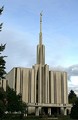
Seattle Templeby margiemuComment by neophyte: Very modern looking church. Nice comp and subject. Photo, however is a little dark especially at the base of the church. |
| Photographer found comment helpful. |
| 05/11/2006 08:10:19 PM |
|
| Photographer found comment helpful. |
| 05/11/2006 08:06:31 PM |
|
| Photographer found comment helpful. |
| 05/11/2006 12:01:27 PM |
|
| Photographer found comment helpful. |
| 05/11/2006 11:10:46 AM |
Sleep Like a Babyby margiemuComment by alexgarcia: From the CTP MkII
First Impression: it doesn't deserves so low score, IMO. Cute girl.
Composition: Maybe a bit too centered subject, needs some dynamism.
Subject: Nice idea and good cliche. You've selected a wonderful girl, but maybe a little "old" to be considered a baby.
Technical: I think the main problem with the score of this photo comes from the lightening. In interiors I think that is very difficult to lighten properly without the experience and equipment many DPCers have. I don't know how to explain it but lights doesn't look professional. And voters are very cruel with this... that's DPC.
Improvement: basically the light (see up^^).
Summary: Nice idea and subject but needs a bit more work on lightening.
Álex
|
| Photographer found comment helpful. |
| 05/11/2006 02:57:37 AM |
Sleep Like a Babyby margiemuComment by Oddfrog: Hi!
I like this idea!
I would have cropped the pic a tiny bit closer to the head
The blue cast on her face makes it look a bit pale. (But you cant determine where shw's gonna fall asleep, so I'll forgive you;>)
I don't have much else to say really. Its a very good attempt:) Well done:) |
| Photographer found comment helpful. |
Home -
Challenges -
Community -
League -
Photos -
Cameras -
Lenses -
Learn -
Help -
Terms of Use -
Privacy -
Top ^
DPChallenge, and website content and design, Copyright © 2001-2026 Challenging Technologies, LLC.
All digital photo copyrights belong to the photographers and may not be used without permission.
Current Server Time: 06/26/2026 06:38:31 PM EDT.