| Image |
Comment |
| 05/14/2006 11:18:24 PM |
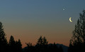
just before dawnby margiemuComment by blackenedwhite: From the CTP MkII
Sorry, couldn't help but look at other people's comments to see what's been said and what's not.
Whatever I have to say has already been said. And I'd have to agree with Gunnsi as his crits echo mine, word for word (minus the "I love sunsets" thing ;p).
All I could add, I guess, is that try using levels or brightness contrast to cut through that muddy look. |
 Photographer found comment helpful. Photographer found comment helpful. |
| 05/14/2006 11:09:48 PM |
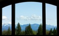
Room With a Viewby margiemuComment by blackenedwhite: From the CTP MkII
Why don't you go a full 640? It's as small as it is without you shortening it up a bit more. Your 20D can handle a lot more than that.
One of your better shots, IMO. Still wanting in the PP department, but getting there.
A polarizer (or some PP) would've cut through the haze, as it takes a lot of punch from the shot.
Great take on the challenge. |
| Photographer found comment helpful. |
| 05/14/2006 11:04:15 PM |
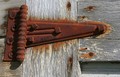
barn hingeby margiemuComment by blackenedwhite: From the CTP MkII
Here to add another comment on this photo.;p
Getting just one comment's a bit harsh. Anyways, I guess this one didn't stand out amongst the other entries in this challenge.
It doesn't say much, and it's not eye candy. A bit of PP would've placed it higher, but PP could only get you so far.
It's an average shot. You could do better.;p |
| Photographer found comment helpful. |
| 05/14/2006 12:16:13 PM |
|
| Photographer found comment helpful. |
| 05/14/2006 12:38:25 AM |
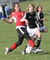
Snohomish Invitational GU-13 Finalsby margiemuComment by DigiFotoBuddy: Greetings from your own critique club.
First Impression
Nice sport action shot.
Composition:
Composition is okay. Don't like the people in the background though. The tilted net also bothers me.
Subject:
I really like the subject. Fits the challenge well.
Technical (Colour and light):
The colors are perfect. Lighting on the middel girl is bit harse.
Improvement:
I don't really know if it was possible to crop the people in the back ground. The lighting it too bright on the middle and left side girl. Just wonderig if it would have looked better in B/W.
Summary:
NIce shot, meets the challenge. Well done.
Cheers!! |
| Photographer found comment helpful. |
| 05/14/2006 12:30:17 AM |
Sleep Like a Babyby margiemuComment by DigiFotoBuddy: Greetings from your own critique club.
First Impression
Very Cute.
Composition:
Very good composition.
Subject:
She is very cute. It does meet the challenge. The only reason this could have done bad is due to some voters doesn't score Flowers, kids/baby pictures, pets. This one should have done better than this IMO.
Technical (Colour and light):
The lighting is good. I always like the natural light. Little to blue for my taste, and too bright for the theme itself. The light on upper left corner is blown out.
Improvement:
Color adjustment, may be B&W or Duotone with low light??
Summary:
Nice picture over all and definately desereves better than what is got.
Cheers!! |
| Photographer found comment helpful. |
| 05/13/2006 10:16:09 PM |
|
| Photographer found comment helpful. |
| 05/13/2006 09:34:02 PM |
|
| Photographer found comment helpful. |
| 05/13/2006 12:27:29 PM |
|
| Photographer found comment helpful. |
| 05/13/2006 02:21:10 AM |
|
| Photographer found comment helpful. |
Home -
Challenges -
Community -
League -
Photos -
Cameras -
Lenses -
Learn -
Help -
Terms of Use -
Privacy -
Top ^
DPChallenge, and website content and design, Copyright © 2001-2026 Challenging Technologies, LLC.
All digital photo copyrights belong to the photographers and may not be used without permission.
Current Server Time: 06/26/2026 06:37:42 PM EDT.