| Image |
Comment |
| 05/27/2006 06:35:16 AM |
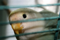
Trapped and happy ?!?!by ApeeComment by ericwoo: Hey there from the Critique Club
Camera Work/Technical: The flash is a little harsh, dumping some bothersome shadows across the bird's head and body. The focus is spot on, and your depth of field use is very nice.
Lighting: Again, a little harsh with the flash. Also, the window in the background is a little too bright for the subject.
Composition/Content: Very busy. The cage probably hurt this one as much as voters' opinions that this didn't meet the challenge. Pulling the bird out of the cage would have surely helped it out.
My Opinion: It is not what I had in mind for an environmental portrait. My opinion of an environmental portrait is a person immersed in their work or play environment, looking at the camera with some sort of expression. While it is a portrait of a pet, it just doesn't fit into my personal framework. |
 Photographer found comment helpful. Photographer found comment helpful. |
| 05/25/2006 09:39:09 PM |
|
| Photographer found comment helpful. |
| 05/25/2006 08:56:25 PM |
Huh ?by ApeeComment by Rikki: hehhehehehee... time to replace the old mug on yer profile eh sebastian? |
| Photographer found comment helpful. |
| 05/23/2006 05:21:43 PM |
|
| 05/23/2006 02:04:45 PM |
Kinda Hot !by ApeeComment by 2Shay: This could have been a great photo. The background is a bit clutterd, which distracts from the overall effect. The angle seems a bit "extreme" to me, which may have been your intent, but I found to also be distracting. Very cool effect. |
| Photographer found comment helpful. |
| 05/23/2006 02:51:40 AM |
|
| Photographer found comment helpful. |
| 05/22/2006 08:07:46 PM |
Kinda Hot !by ApeeComment by lkn4truth: The composition is ok. The image quality is ok. The subject matter is ok. The creativity is ok. |
| Photographer found comment helpful. |
| 05/22/2006 05:56:27 PM |
|
| Photographer found comment helpful. |
| 05/21/2006 10:41:45 PM |
In memory of...by ApeeComment by outland: The background seems a bit busy and the really bright spot in the upper center is distracting. The rose looks really good. Sharp and I love that red. |
| Photographer found comment helpful. |
| 05/21/2006 03:31:11 PM |
Huh ?by ApeeComment by Rebecca: Nice tone, perhaps some unsharp mask to make the details pop? It looks a little flat. |
| Photographer found comment helpful. |
Home -
Challenges -
Community -
League -
Photos -
Cameras -
Lenses -
Learn -
Help -
Terms of Use -
Privacy -
Top ^
DPChallenge, and website content and design, Copyright © 2001-2026 Challenging Technologies, LLC.
All digital photo copyrights belong to the photographers and may not be used without permission.
Current Server Time: 07/16/2026 09:36:50 PM EDT.