| Image |
Comment |
| 06/15/2005 05:27:25 AM |
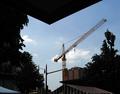
Echoby darkyodaComment by Matthew: The image is interesting, but IMO falls a little betwen stools. I like the repetition of angles in the roof and the crane, but to effectively featured that repetition as a central element, I would have included nothing but the roof and crane in the shot: the rest of the foreground clutters that part of the image. This may have been impractical (you would have had to have used a different shooting angle - I think probably by getting higher and closer to the roof line. To create a more general image (not focussing solely on the repeated angles), the foreground needs to be better exposed and add interest to the shot. This might easiest be done using the curves tool in PS (enabling you to lighten the dark areas without over exposing the bright areas).
The LHS of the image appears to add little to the photo and the crane is quite central (not always a good thing) - I would have played around with the composition a bit by cropping the photo in various ways to see if I could have improved it.
Overall, the idea is good, but the technical side (underexposing the foreground) and composition (not focussing hard on the interesting element (the angles), and/or leaving too much in the cluttered foreground) move this into the middle to low middle scores for me.
Hope this helps explain one viewpoint! Good luck in the future. |
| 06/15/2005 05:14:34 AM |
Echoby darkyodaComment by ergo: I have a kitten named Yoda...
Feels too busy, and flat. My eyes are searching for a subject in the image. The crane is right there, but there's too much competition. The yellow light box that obscures a part of the crane, the light fixtures on the right side, etc. The striped, sloped tent makes a nice counter point to the angling of the crane, but the stripes don't quite work. I'd reckon crop in closer to the crane itself, highlight it as a singular object. I actually think there's something interesting that could be done with the triangular black overhanging shape, as well. |
| 06/15/2005 05:04:13 AM |
Echoby darkyodaComment by darkyoda: Thanks for the comments everyone. I know the shot was far from perfect, so thanks to everyone that gave me feedback on what they liked or didn't like about it. :) |
| 06/14/2005 10:49:36 PM |
Echoby darkyodaComment by graphicfunk: Good composition by taking advantage of the overhang to add interest. Bumping up. |
| 06/14/2005 10:42:32 AM |
|
| 06/10/2005 07:17:04 PM |
|
| 06/10/2005 04:25:08 PM |
Echoby darkyodaComment by ddng: Fairly well composed and nice framework with the dark trees and the roof. The red and white striped roof at the bottom is a subtracts from the photo IMO. |
| 06/09/2005 04:33:19 PM |
|
| 06/08/2005 01:10:08 PM |
|
| 06/08/2005 10:32:28 AM |
|
Home -
Challenges -
Community -
League -
Photos -
Cameras -
Lenses -
Learn -
Help -
Terms of Use -
Privacy -
Top ^
DPChallenge, and website content and design, Copyright © 2001-2026 Challenging Technologies, LLC.
All digital photo copyrights belong to the photographers and may not be used without permission.
Current Server Time: 06/27/2026 08:27:36 PM EDT.