| Image |
Comment |
| 08/03/2005 09:17:18 AM |
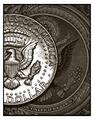
almighty...by renonovadoComment by Jutilda: Of all the money shots, I like this one best. You concentrate on the duplicity of the circular qualities and it works with the shiny against the dull. Nice close up. |
 Photographer found comment helpful. Photographer found comment helpful. |
| 08/03/2005 01:44:13 AM |
almighty...by renonovadoComment by Nald: Beautiful photo, I'm glad that someone read the rules of the challenge! 10. If I could give you an 11 I would! |
| Photographer found comment helpful. |
| 08/03/2005 01:18:51 AM |
almighty...by renonovadoComment by Marc923: I really like the visual impact of this picture. I like the setup of the same image on the two forms of currency. |
| Photographer found comment helpful. |
| 08/01/2005 07:43:09 AM |
Block Planeby renonovadoComment by carlos: Planes are very popular this week 'roun here isn't it?
A litthe too dark on the dark side and quite strong shadow. a white reflector will have done the trick. |
| Photographer found comment helpful. |
| 07/31/2005 01:13:43 PM |
Embossed and Stampedby renonovadoComment by Rikki: Hey great capture here. IMO I would have darkened the upper right hand corner of the photo so that it matches with the lower left hand corner. I like the tilt of the camera here and it's extremely very effective. Good shot! |
| 07/31/2005 10:27:18 AM |
Block Planeby renonovadoComment by macrothing: 4 - DMC. There is only one 'tool' here (blade not inclusive) and ok, the trade is fairly well assumed but still only one tool. I like the shot though and the lighting, it is nice and clean .... but for me, meeting the Challenge is the priority. |
| 07/29/2005 10:39:48 PM |
Block Planeby renonovadoComment by beady: Nice shot of the hand plane, with white background. I would have liked to see it sitting on a blank of wood with white backgound. |
| Photographer found comment helpful. |
| 07/29/2005 01:16:59 PM |
|
| Photographer found comment helpful. |
| 07/28/2005 11:11:40 PM |
Block Planeby renonovadoComment by Makka: This would of been great if you had another light source to remove some of the shadows! I just find them too strong here! Well done though! |
| Photographer found comment helpful. |
| 07/28/2005 10:08:38 AM |
Block Planeby renonovadoComment by Jutilda: Nice simple use of negative space. The shadow is interesting. I might lose one side so that it's not dead centered, although in this shot, it's not totally unattractive to the eye. I might up the contrast on the plane just a bit to show more of it's detailing. |
| Photographer found comment helpful. |
Home -
Challenges -
Community -
League -
Photos -
Cameras -
Lenses -
Learn -
Help -
Terms of Use -
Privacy -
Top ^
DPChallenge, and website content and design, Copyright © 2001-2026 Challenging Technologies, LLC.
All digital photo copyrights belong to the photographers and may not be used without permission.
Current Server Time: 07/15/2026 11:39:39 PM EDT.