| Image |
Comment |
| 05/10/2006 05:57:57 AM |
|
 Photographer found comment helpful. Photographer found comment helpful. |
| 05/09/2006 10:35:33 PM |
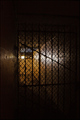
Secret WWII-Era Prison Discoveredby chaliceComment by tngrndream: hello again.
while i liked the mystery surrounding the title, i felt the image was a bit too dark.
the iron gate is nice leading into the hallway, but i did not feel it was the "big story". the bigger story would have been the cache in the prison, not the gate. unless of course the gate is supposed to be the cell. but i did not feel like i was in a cell, but an apartment complex. ifn you had some sort of bed on the other side to signify more of a prison type feel that would have been better. a steel plate and cup. something to make me feel like the darkness is "dark".
which led me to only looking at the picture for some sort of salvage. i thought the picture stand alone (without title) was like one of my images.... mediocre at best. |
| Photographer found comment helpful. |
| 05/09/2006 03:46:24 PM |
|
| Photographer found comment helpful. |
| 05/09/2006 11:09:20 AM |
Secret WWII-Era Prison Discoveredby chaliceComment by kirsty_mcn: trading post
Hmmm...
I think you've got the exposure perfect as an image, but maybe this darkness would not be appropriate for a newspaper. I like how the eye is led in with the perspective and lighting.
Focus seems a little soft, but not too noticeable.
The dirtyness of the fencing suits the mood.
I think if you cropped off a tiny bit of the left hand side, the composition could be stronger .
woah, I didn't look at the score on this - WAY underrated, guess its very susceptible to monitor differences. I would have expected a 5.4 - technically good, nice originality, but not wow or front-page material. Definitely should have done better than mine :P |
| Photographer found comment helpful. |
| 05/09/2006 09:25:54 AM |
|
| Photographer found comment helpful. |
| 05/09/2006 06:16:23 AM |
|
| Photographer found comment helpful. |
| 05/09/2006 03:09:03 AM |
|
| Photographer found comment helpful. |
| 05/09/2006 01:46:26 AM |
Dad's Patricide Comedyby chaliceComment by sjturner: nice idea, colour a bit too orange and the background lets it down big time, nice panama though. Shot would have been cool with someone in a ski mask refelcting in the sunglasses (you'd have had to change the title:-) |
| Photographer found comment helpful. |
| 05/08/2006 10:38:19 PM |
Secret WWII-Era Prison Discoveredby chaliceComment by Louis: Slightly underexposed and soft, though the central light leads the eye through the image in a satisfying way. It's probably a bit too underexposed, however. If this were corrected, and the fence links were razor sharp, and you had decided on b/w to enhance the WWII theme, it may have done better. |
| Photographer found comment helpful. |
| 05/08/2006 09:00:22 PM |
Secret WWII-Era Prison Discoveredby chaliceComment by Melethia: Trading Post comment
The thing I like alot about this picture is the perspective and the angles created. It's still a bit too dark for my taste, though it does invite the viewer to look more carefully to see what's there. As I said during voting, I do think this would be a good picture to accompany a magazine article but with a bit more light to pull out the texture and detail of the walls. |
| Photographer found comment helpful. |
Home -
Challenges -
Community -
League -
Photos -
Cameras -
Lenses -
Learn -
Help -
Terms of Use -
Privacy -
Top ^
DPChallenge, and website content and design, Copyright © 2001-2026 Challenging Technologies, LLC.
All digital photo copyrights belong to the photographers and may not be used without permission.
Current Server Time: 06/21/2026 02:58:11 PM EDT.