| Image |
Comment |
| 03/12/2008 01:46:31 AM |
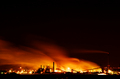
Scorched Earthby VitaminBComment by AP: I see where you were going with this but i feel like there is a tad too much negative space up top, composition doesn't feel right with me. Excellent clarity, 7 |
 Photographer found comment helpful. Photographer found comment helpful. |
| 02/01/2008 02:48:10 PM |
|
| Photographer found comment helpful. |
| 01/31/2008 07:10:58 AM |
The Blue Brothersby VitaminBComment by Melethia: Pretty good shot showing the whole brotherly concept. To really bring out the details (one looks older than the other, for instance), you need a bit sharper focus. |
| Photographer found comment helpful. |
| 01/30/2008 02:44:39 PM |
|
| Photographer found comment helpful. |
| 01/30/2008 02:43:56 PM |
|
| Photographer found comment helpful. |
| 01/29/2008 08:07:24 AM |
|
| Photographer found comment helpful. |
| 01/28/2008 11:02:20 AM |
|
| Photographer found comment helpful. |
| 01/28/2008 08:45:26 AM |
The Blue Brothersby VitaminBComment by MaryO: They're doing some serious shredding of that sisal. The one on the right looks like he's thinking up something dastardly to do. |
| Photographer found comment helpful. |
| 01/28/2008 12:39:03 AM |
|
| Photographer found comment helpful. |
| 01/27/2008 04:53:40 PM |
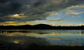
A Storm Approachesby VitaminBComment by k4ffy: should have aimed a bit higher, to remove the distracting shore in the extreme foreground, and added more sky for more dramatic effect because of the clouds. |
| Photographer found comment helpful. |
Home -
Challenges -
Community -
League -
Photos -
Cameras -
Lenses -
Learn -
Help -
Terms of Use -
Privacy -
Top ^
DPChallenge, and website content and design, Copyright © 2001-2026 Challenging Technologies, LLC.
All digital photo copyrights belong to the photographers and may not be used without permission.
Current Server Time: 09/28/2026 04:48:30 AM EDT.