| Image |
Comment |
| 08/17/2009 03:53:45 AM |
|
 Photographer found comment helpful. Photographer found comment helpful. |
| 08/17/2009 01:05:23 AM |
The Holy Grail by VitaminBComment by Covert_Oddity: Great effect, would like to see how you put this one together. Nice clean shot, to the point and manages to be interesting in a challenge which makes it difficult to be original! Good job, 9 from me. |
| Photographer found comment helpful. |
| 08/16/2009 02:38:25 AM |
|
| Photographer found comment helpful. |
| 08/15/2009 09:55:50 PM |
|
| Photographer found comment helpful. |
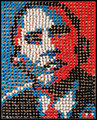
| 08/15/2009 02:46:00 AM |
HOPEby VitaminBComment by organic: seriously...your assumption is "Also, for the low scores, I guess some of you cannot get past your politics when voting for a photo eh!"
It's not the picture, it's their politics... it's not you that took a bad picture, it's they are small minded?
wow...no wonder
If you want some politics let me know and I'll post my tribute to atlas shrugged. You should read it some time |
| Photographer found comment helpful. |
| 08/14/2009 11:49:18 AM |
|
| Photographer found comment helpful. |
| 08/14/2009 11:42:46 AM |
The Huntedby VitaminBComment by Sheryll: Oh brave man you are. I hope that wasn't loaded. Shallow dof works great. I can see though that his hands aren't properly positioned (well I think not since I'm not sure of the type of gun). |
| Photographer found comment helpful. |
| 08/14/2009 11:24:34 AM |
A Good Catchby VitaminBComment by Tlee05: As soon as I saw this I thought Gnato! Great picture none of the less! Think you reminded me of some fishy ideas :) |
| Photographer found comment helpful. |
| 08/14/2009 08:07:28 AM |
|
| Photographer found comment helpful. |
| 08/13/2009 03:37:29 PM |
|
| Photographer found comment helpful. |
Home -
Challenges -
Community -
League -
Photos -
Cameras -
Lenses -
Learn -
Help -
Terms of Use -
Privacy -
Top ^
DPChallenge, and website content and design, Copyright © 2001-2026 Challenging Technologies, LLC.
All digital photo copyrights belong to the photographers and may not be used without permission.
Current Server Time: 06/25/2026 12:49:50 AM EDT.