| Image |
Comment |
| 08/04/2010 02:55:44 AM |
|
 Photographer found comment helpful. Photographer found comment helpful. |
| 08/04/2010 01:00:57 AM |
|
| Photographer found comment helpful. |
| 08/03/2010 10:06:37 PM |
Shades of Grayby The EskimoComment by DrAchoo: This is a pretty nice picture for the bird being faced away from you. It's so common to have them this way and usually it's a case of "too much ass, not enough face", but you capture the birds turned head quite nicely. I like the bokeh as well and think it provides a good balance for the bird. As with the others, it looks like you could sharpen just a bit. |
| Photographer found comment helpful. |
| 08/03/2010 10:04:47 PM |
Weathered Woodby The EskimoComment by DrAchoo: I think the composition is pretty nice here. Good contrasting colors. Nice subject. One common thing I've noticed as I leave these comments on different people is that people tend to not let their subjects breathe with enough negative space. This looks cramped on the right and top and possibly even the bottom. |
| 08/03/2010 10:02:52 PM |
DSC_9375-Wash-memorial.jpgby The EskimoComment by DrAchoo: This is nice. The colors are great and the reflection is wonderful. It does seem in general you should learn to sharpen your work a bit. This looks soft. I would also consider cropping the bottom off so the water goes all the way to the bottom of the canvas. |
| 08/03/2010 10:01:05 PM |
Blue Umbrellasby The EskimoComment by Alicia: I like this a lot. The colors are so straight forward and the perspective makes for an interesting image. |
| Photographer found comment helpful. |
| 08/03/2010 10:00:38 PM |
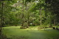
Sea of Greenby The EskimoComment by DrAchoo: I love landscape. This area shows real promise. Technically I might as for some more contrast, but I probably want a foreground subject or at least something to attract the eye. Here because of the monotones and similarities in the trees our eye doesn't land anywhere and stay. It bounces all over the canvas looking for something else. |
| 08/03/2010 10:00:34 PM |
|
| Photographer found comment helpful. |
| 08/03/2010 09:58:43 PM |
Property Lineby The EskimoComment by DrAchoo: I'm enjoying looking through people's portfolios. I've often started with a 5.5 score because it generally means promise that wasn't fulfilled. A few things grab me with this shot. First, you have found a nice leading line, but the problem is it doesn't lead to anywhere. If anything, it leads to that clump of bush which is very unexciting for us. I'm glad to see you used a polarizer. You may have wanted to try to saturated or darken the sky a bit more in processing. Sometimes you can set a new layer to multiply and then provide a gradient down the sky. That can look very nice. The gold does contrast nicely with the blue. |
| 08/03/2010 09:25:25 PM |
Beach-and-Oceanby The EskimoComment by Pug-H: There are not many people on the beach. I saw a picture in the Japanese newspaper the other day of Enoshima Beach; boy, was it crowded. Message edited by author 2010-08-03 21:25:37. |
| Photographer found comment helpful. |
Home -
Challenges -
Community -
League -
Photos -
Cameras -
Lenses -
Learn -
Help -
Terms of Use -
Privacy -
Top ^
DPChallenge, and website content and design, Copyright © 2001-2026 Challenging Technologies, LLC.
All digital photo copyrights belong to the photographers and may not be used without permission.
Current Server Time: 07/16/2026 05:09:13 AM EDT.