| Image |
Comment |
| 12/21/2005 09:03:51 AM |
Sweet Toothby DianaComment by dahkota: excellent color rendition. Like the shadows. DOF excellent. 7 - good luck in the challenge! |
 Photographer found comment helpful. Photographer found comment helpful. |
| 12/07/2005 06:23:12 PM |
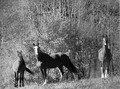
High Contrast B/Wby DianaComment by just-married: Interestingly, before I read your title, my first thought was "it's very gray and could use a boost in contrast." I can see where any more contrast on the center horse might have been over the top, but with advanced editing you could have used a mask. Mostly I see gray. |
| Photographer found comment helpful. |
| 12/05/2005 08:34:32 PM |
High Contrast B/Wby DianaComment by jduffett: I think the horses could be a touch sharper, and either a larger or smaller DOF. The background takes up a large portion of the picture, and I find it frustratingly in between focused and totally blurred out--I can see the detail, but it's not sharp enough to be appealing. I think I would like it best with a large DOF and everything in focus, but smaller DOF to blur the background more could work too. |
| Photographer found comment helpful. |
| 12/04/2005 02:03:01 PM |
High Contrast B/Wby DianaComment by Jutilda: I don't sense high contrast. I sense blurred and blown out. This has great potential, but it's tilted too. I'd straighten it, make sure I had tack sharp focus and shoot when the light isn't so bright. As it is, it blanches them out somewhat. I might zoom in on a single horse for more impact. |
| 12/02/2005 12:06:11 AM |
High Contrast B/Wby DianaComment by mk: Not really much pop to this photo. It's hard to say without seeing it in color but I feel like maybe it would do better that way. There seems to be some odd editing effects around the horse on the left and at the feet of the horse on the right and in some random places throughout the rest of the photo - dodged maybe? There just isn't enough to draw the horses out of the background. |
| 11/14/2005 12:44:48 PM |
|
| Photographer found comment helpful. |
| 11/13/2005 08:01:37 PM |
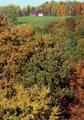
Country Laneby DianaComment by crabappl3: nice leading line. The road does not appear to dead end, just end. The focus also appears to be soft to me. |
| Photographer found comment helpful. |
| 11/13/2005 12:36:42 AM |
Portrait of a Landscapeby DianaComment by Artifacts: Good attempt at a Fall landscape scene. Composition is decent. The colors are a little weak and the focus is a little soft for my taste. |
| Photographer found comment helpful. |
| 11/12/2005 08:29:04 PM |
|
| Photographer found comment helpful. |
| 11/12/2005 12:55:02 PM |
Country Laneby DianaComment by armelle: It's actually a very nice angle and you really get the feel of the sinuous road! IMHO, more luminosity and a less soft focus would help a bit... |
| Photographer found comment helpful. |
Home -
Challenges -
Community -
League -
Photos -
Cameras -
Lenses -
Learn -
Help -
Terms of Use -
Privacy -
Top ^
DPChallenge, and website content and design, Copyright © 2001-2026 Challenging Technologies, LLC.
All digital photo copyrights belong to the photographers and may not be used without permission.
Current Server Time: 06/12/2026 05:59:12 AM EDT.