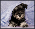
DPChallenge: A Digital Photography Contest You are not logged in. (log in or register
 
Browse Settings
Currently viewing:
Registered UserShutterPug

Show comments:

Per page:

Order:

Comments:


Comments Received by ShutterPug
Pages:   ... [282] [283] [284] [285] [286] [287] [288] ... [586]
Showing 2841 - 2850 of ~5852
Image Comment
Llama Llama Frozen Llama
03/26/2008 02:46:51 PM
Llama Llama Frozen Llama
by ShutterPug

Comment by Melethia:
I very much agree with the inclusion of the llamas to add interest to this. A shot of just the fence would have been boring. And may have scored higher. In part, I think the scoring issues of late is a crop of newer members, who are still wowed by the "wow" factor. As they develop as photographers, they'll begin to see the bigger picture. I hope.
Photographer found comment helpful.
Llama Llama Frozen Llama
03/26/2008 02:31:21 PM
Llama Llama Frozen Llama
by ShutterPug

Comment by alexjack:
Hi Linda, thought I'd add my 2 cents worth. I like your idea about a closer crop to the fence, trees and ice. I would probably have looked there first, I think including the llamas tends to add another idea that pulls the eye away from the fence. The leading lines you have also tend to direct the eye up and then off the page behind the llamas. A crop as described above tends become dynamic when you position the yellows of the trees and ground against the blues of the ice, with the fence the major idea demarcating them. Just an idea, overall you have many great shots, just a matter of time really.

Jack
Photographer found comment helpful.
Waldo's 'lil red wagon
03/26/2008 02:17:03 PM
Waldo's 'lil red wagon
by ShutterPug

Comment by trevytrev:
As per your request. This is my fav of the four you asked about in your thread. I would have voted this a 7 maybe an 8. The high key background works and the red wagon adds a nice splash of color, it's alos nicely composed. I do think it could be a bit sharper, maybe a bit of USM. I do think that some may have had an issue of having a hard time to make the eye connection. Your model has dark fur and dark eyes, which makes it hard to light them properly. People instinctively go to the eyes of a subject and want them well lit and sharp so they can make a connection.
Photographer found comment helpful.
Peek-a-pup
03/26/2008 02:09:28 PM
Peek-a-pup
by ShutterPug

Comment by trevytrev:
Adding a comment from your thread. The lighting seems a bit harsh and off in this shot, which isn't easy with the dark fur friend you have. The eyes are just a bit too dark to make that connection. As Louis stated the focus seems a bit soft as well. I am not a fan of the color of cloth used and the type of material that it is, it reflects too much light taking focus away from your cute buddy. I gave this a 6 and do recall thing that I felt is was cute but that the main issue with me was the lighting and then the color.

Message edited by author 2008-03-26 14:09:40.
Photographer found comment helpful.
Feathered
03/26/2008 02:04:04 PM
Feathered
by ShutterPug

Comment by trevytrev:
This was a hard challenge and almost everyone scored low. It it is nature for us to want to see things in focus and sharp and while blur and soft focus and work, more often it doesn't. This has a nice abstrat feel but I don't think the blur added anything to the shot, which is what people were looking for in this challenge. The color is nice and the compositon seems nice but as I stated the blur doesn't make your subject anymore interesting, just blurry. I would have voted this a 5.
Photographer found comment helpful.
Llama Llama Frozen Llama
03/26/2008 01:59:09 PM
Llama Llama Frozen Llama
by ShutterPug

Comment by trevytrev:
I saw that you asked for some critque so I give you my opinon. I feel that the shot seems unbalanced with it being weigthed to the left with the clutter of trees. The high, looking down perspective feels a bit odd to me as well, maybe getting closer to the fence and being more on the ground level could help. This also has an appearance of being slanted from right to left, I don't know if it's the scene or if you could crop it to make it more level but it adds to the unbalanced feel I was talking about. Hope that helps, I would have voted this a 5 if I had voted this challenge.
Photographer found comment helpful.
Peek-a-pup
03/26/2008 01:59:08 PM
Peek-a-pup
by ShutterPug

Comment by Louis:
From this thread: The subject is probably the first thing that garnered the large number of mid-range votes of 5. Cute pet photos probably do best only in subject-related challenges, such as Pet Portrait. Consider that your other shot of the pup in Pet Portrait III had more sixes than fives, probably for this reason.

There's nothing particularly engaging about Peek-a-pup, even though the dog is very cute, and acting in a cute way. For example, nothing has separated this picture from the large number of pet snaps that exist on Flickr, DPC, or many other websites.

Focus on the little guy's nose is sharper than on his eyes. If his eyes were lit well, or had interesting catchlights making his eyes look very big, maybe the photo would connect with more people. As it is, his dark eyes are almost lost in his dark fur.

The similarity of colour between the "backdrop" and the floor create a very unidimensional quality to this photograph, making it somewhat bland.

Overall, the picture lacks sharpness. It's a little soft.

It might have been improved by the following:

Ensure the image is tack-sharp. Let's see the individual strands of fur, or some detail that engages the viewer. I love blur and soft focus as an intentional effect, but for this style of photo, I consider sharpness essential. Check yanko's cat portraits for an example.

There are basically two colours here: grey and purple. Mix it up in your backgrounds, floor, add a red ribbon to your pet, etc. Add something interesting to the frame.

The framing/cropping itself is not very interesting, and should engage the viewer. Had we seen more of his environment, perhaps with the dog more to right-of-frame, it might have been more of an interesting view.
Photographer found comment helpful.
Llama Llama Frozen Llama
03/26/2008 01:49:34 PM
Llama Llama Frozen Llama
by ShutterPug

Comment by smardaz:
i am wondering if you really pumped up the blue of the ice, it seems a little too blue, at least on the monitor i am looking at. i also think that if you had gon with a different pov and just focused on the part of the fence that was in the ice it might have scored better. but hey! 5.6 is nothing to sneeze at, it puts you ahead of the middle of the pack
Photographer found comment helpful.
the hatchlings
03/26/2008 01:20:08 PM
the hatchlings
by ShutterPug

Comment by Yo_Spiff:
Nicely done. I like the use of selective desaturation here.
Photographer found comment helpful.
the hatchlings
03/25/2008 03:48:29 PM
the hatchlings
by ShutterPug

Comment by Damzel:
Love the black and white, makes this just POP!
Photographer found comment helpful.
Pages:   ... [282] [283] [284] [285] [286] [287] [288] ... [586]
Showing 2841 - 2850 of ~5852


Home - Challenges - Community - League - Photos - Cameras - Lenses - Learn - Help - Terms of Use - Privacy - Top ^
DPChallenge, and website content and design, Copyright © 2001-2025 Challenging Technologies, LLC.
All digital photo copyrights belong to the photographers and may not be used without permission.
Current Server Time: 09/17/2025 01:42:00 PM EDT.