| Image |
Comment |
| 10/21/2005 07:58:29 PM |
|
 Photographer found comment helpful. Photographer found comment helpful. |
| 10/21/2005 09:18:53 AM |
|
| Photographer found comment helpful. |
| 10/19/2005 10:27:49 PM |
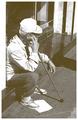
What Next?by ttibbyComment by wee_ag: Descent shot, but too washed out. More contrast and a different angle would make the shot much more interesting. |
| Photographer found comment helpful. |
| 10/19/2005 05:54:56 AM |
What Next?by ttibbyComment by Suki: my favorite in the challenge.
So simple, but makes me stop and ask myself what is he thinking of.
meets the challenge so perfectly.
I love the hazy look of no blacks against blown out whites.
Well done! |
| Photographer found comment helpful. |
| 06/20/2005 02:19:31 PM |
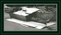
Fighting Daylightby ttibbyComment by Nuno: If it wasen't for the frame it would have pointed the double to me, this way is the midle of the scale. Good subject, good chice of b&w for dramatic aproach, laugsy border, and complex too. |
| Photographer found comment helpful. |
| 06/20/2005 10:52:14 AM |
Fighting Daylightby ttibbyComment by tate: This is an image that looks like a comedy skit - sadly, it is not, right?! - nice image - I would have bumped up the dark areas to get the full spectrum - 6 |
| Photographer found comment helpful. |
| 06/20/2005 07:27:14 AM |
Fighting Daylightby ttibbyComment by Artifacts: Certainly a subject worthy of the challenge topic. The image has no serious hot spots and the greyscales are generally good. B&W is a good choice for this subject.
The border takes up a considerable percentage of image real estate and may be considered distracting to some viewers because there is no obvious way it supports the main subject.
Technically there are a couple aspects of this image that will keep it's score lower. The image is low contrast. This is made even more pparent by your black border. You should set a black point for it or darken blacks using selective color black adjustment or channel mixer slider adjustments. Perhaps you used low cotrast on purpose. If so, it will not work with most voters.
The image is presented from the "snapshot" perspective. It appears to have been taken simply while walking by. A different perspective like ground level may have been more interesting to the viewer and connected better to the theme of being down and out. Consider a closer crop to more closely highlight the person themselves. |
| Photographer found comment helpful. |
| 06/17/2005 11:29:50 AM |
Fighting Daylightby ttibbyComment by mesmeraj: for me the added border really detracts from the image. The frame looks like some fancy oil painting frame & doesnt suit the subject matter. So much soild black also makes your image see watered down because you have no equal blacks to match the frame. Good image, just bad choice of border. |
| Photographer found comment helpful. |
| 06/17/2005 07:35:21 AM |
|
| Photographer found comment helpful. |
| 06/16/2005 11:12:06 PM |
|
Home -
Challenges -
Community -
League -
Photos -
Cameras -
Lenses -
Learn -
Help -
Terms of Use -
Privacy -
Top ^
DPChallenge, and website content and design, Copyright © 2001-2026 Challenging Technologies, LLC.
All digital photo copyrights belong to the photographers and may not be used without permission.
Current Server Time: 07/15/2026 04:04:16 PM EDT.