| Image |
Comment |
| 08/24/2004 06:08:28 AM |
|
| 08/23/2004 09:30:23 PM |
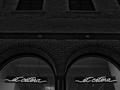
et ceteraby undieyatchComment by sprite777: no matter how you cut it, color, or pretend it isn't there, the only thing remotely neon in this picture are the SIGNS.
Please read the submission details. 1 |
| 08/22/2004 05:15:19 PM |
et ceteraby undieyatchComment by admart01: very well done, use of b&w is refreshing, repeating elements make this a stand out. one of my ribbon picks. |
| 08/19/2004 10:52:45 PM |
et ceteraby undieyatchComment by smartypants: I think the et-cetera signs should have been placed at one of the "third lines" if you know what I mean (rule of thirds), but otherwise I like this photo a lot. |
| 08/19/2004 01:00:10 PM |
|
| 08/19/2004 08:34:28 AM |
|
| 08/18/2004 09:26:28 PM |
et ceteraby undieyatchComment by computerking: I like the contrast, but the center of your pic is kinda featureless... I'm focusing too much on the signs at the bottom. Yes, i know they're the point of the challenge. There's just something about the composition I don't like. |
| 08/18/2004 02:11:00 PM |
et ceteraby undieyatchComment by Kolya: strange that you went the B&W route on a neon competition. But here it works well as a stark white on black. Nice work. |
| 08/18/2004 01:19:01 PM |
|
| 08/18/2004 12:57:36 PM |
et ceteraby undieyatchComment by birdyblue: Interesting using black and white. I studied this for a while trying to decide if it truly fit the challenge. I decided I like it and it is interesting and different. Good job! |
Home -
Challenges -
Community -
League -
Photos -
Cameras -
Lenses -
Learn -
Help -
Terms of Use -
Privacy -
Top ^
DPChallenge, and website content and design, Copyright © 2001-2026 Challenging Technologies, LLC.
All digital photo copyrights belong to the photographers and may not be used without permission.
Current Server Time: 05/08/2026 01:16:38 PM EDT.