| Image |
Comment |
| 07/12/2005 03:56:10 PM |
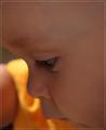
Busyby aboutimageComment by SandyP: I love this one. The most precious part of any family, right??? Beautiful picture! |
 Photographer found comment helpful. Photographer found comment helpful. |
| 07/12/2005 08:38:52 AM |
|
| Photographer found comment helpful. |
| 07/12/2005 05:34:30 AM |
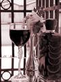
Intimate Settingby aboutimageComment by Falc: B/W Mentor Group.
Still life is not one of my strong points, in fact its one of my pet hates - sorry!!
However, having said that lets have a real look at this image.
WIne, rose, small intimate table, all suggests romance to me, but look at the tonal range you have used. Stark contrasts with very little between shadow and highlight. For me this subject calls for soft easy flowing tones, almost high-key, with parts overblown to let the imagination fill in the blanks. OK its a cliche I know, but maybe it would work ;-)
Hope that doesn't sound too negative. The image is anice enough image but to take it to the next level it needs mmore atmosphere, and a different conversion might add that little something. |
| Photographer found comment helpful. |
| 07/12/2005 12:57:00 AM |
|
| Photographer found comment helpful. |
| 07/11/2005 08:08:15 PM |
|
| Photographer found comment helpful. |
| 07/11/2005 07:55:03 PM |
|
| Photographer found comment helpful. |
| 07/11/2005 03:41:51 PM |
|
| Photographer found comment helpful. |
| 07/11/2005 03:25:35 PM |
Intimate Settingby aboutimageComment by admart01: B/W Club!
The rosy dual tone highlights the element that "normally" is that color (e.g. the wine in this case) and give the shot a bit of a romantic feel. I'm wondering if rose/red/pink does that in general to shots. I like the light and dark tonal variety in the main elements. I'm wondering if you played around with the contrast (you notes don't mention that you did) and what effect did it have? |
| Photographer found comment helpful. |
| 07/11/2005 03:04:28 PM |
Intimate Settingby aboutimageComment by muckpond: B/W Club!
i think this is a nice still life. i'm not sure that it makes the best duotone shot for a couple of reasons.
1) still lifes are normally color. i'm all about breaking rules, but one kind of "expects" to see them that way.
2) there are a couple of things in the photo that also are "expected" to be in color: the wine, flowers, and the oranges particularly. again, anything CAN be in black and white -- the challenge is deciding what SHOULD be.
i think the tones and contrast in this are pretty good. yeah, there are blown-out bits, but i have no problem with those. |
| Photographer found comment helpful. |
| 07/11/2005 12:41:47 PM |
Busyby aboutimageComment by muggle_girl: really nice close up. beautiful eyelashes and such a nice feeling when you look at this, beautiful |
| Photographer found comment helpful. |
Home -
Challenges -
Community -
League -
Photos -
Cameras -
Lenses -
Learn -
Help -
Terms of Use -
Privacy -
Top ^
DPChallenge, and website content and design, Copyright © 2001-2026 Challenging Technologies, LLC.
All digital photo copyrights belong to the photographers and may not be used without permission.
Current Server Time: 07/18/2026 01:09:32 AM EDT.