Natural Divideby
AlexSaberiComment by Artyste: Hello, and greetings from the Critique Club. I am your critiquer, Artyste, and for the next little while, I shall proceed with telling you everything you really don't want to hear :)
Initial Thoughts
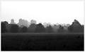
Pretty nice fog and landscape of a skyline, love the tones, might be in the wrong challenge.
Composition / Content
Everything is really good about this composition except one thing. In a photo like this, where you have areas above and below your subject with equal lack of interest (sky and ground in this case), it is usually better to drop your area of interest (the skyline and treeline here), closer to the bottom of the photo. I realize that you were trying to get a darker area to compete with your light area for the "high contrast", but it ultimately fails, and I'll tell you why in a little bit. Having your focal interest lower provides a better anchor for the photo, and eliminates space that distract. In this instance, a more "panoramic" view would have helped the photo itself. (You don't have to add more sky, necessarily, just cropped out about an inch of ground.)
Of course, that's just a suggestion from a bit of reading I've been doing, and personal experience.
Background
A nice fade out into your sky, which is clean and not overly bright.
Camera Work / Technical
You seem to have metered nicely and gotten a good exposure, focus is good as well. Without processing steps, however, I'm not sure if you achieved this in camera or not. Hard to comment. One of the things I can tell you, on the technical side, is this: This photo isn't exactly a great example of a *high* contrast situation. With high contrast, what you are looking for is a stark change from low light values to bright light values in an image. Here, you have a wonderful foggy fade from dark to light. Lots and lots of midtones between the two. This isn't high contrast as I see it. Sure, you have areas of light and dark, but they don't make the change into each other with sharply. Too many mid-values between. This probably cost you a lot of votes.
Digital Processing
I cannot comment on this area, as you haven't mentioned what you did.
Fits the Challenge
As I mentioned above, I feel that you didn't fully meet the challenge because of the fact that there are too many mid-tone values in this image, especially between your darkest and lightest values.
My Opinion of the Photo
Very well taken. With some minor tweaks, and a more "panoramic" feel, this would look good in a large print hanging from any wall. I just feel that it was too loose with the challenge connection (and possibly just too grey and moody), to get you the higher DPC scores that it could probably get in some other challenges. A great attempt. Good luck in future challenges.